Graphic
-
CSK branding
Project
-
Visual identity
-
Logo
Author
-
Marta Komorowska
-
Bartosz Koszałka
-
Ania Prałat
Location
-
Lublin, Poland
Status
-
Competition 2015
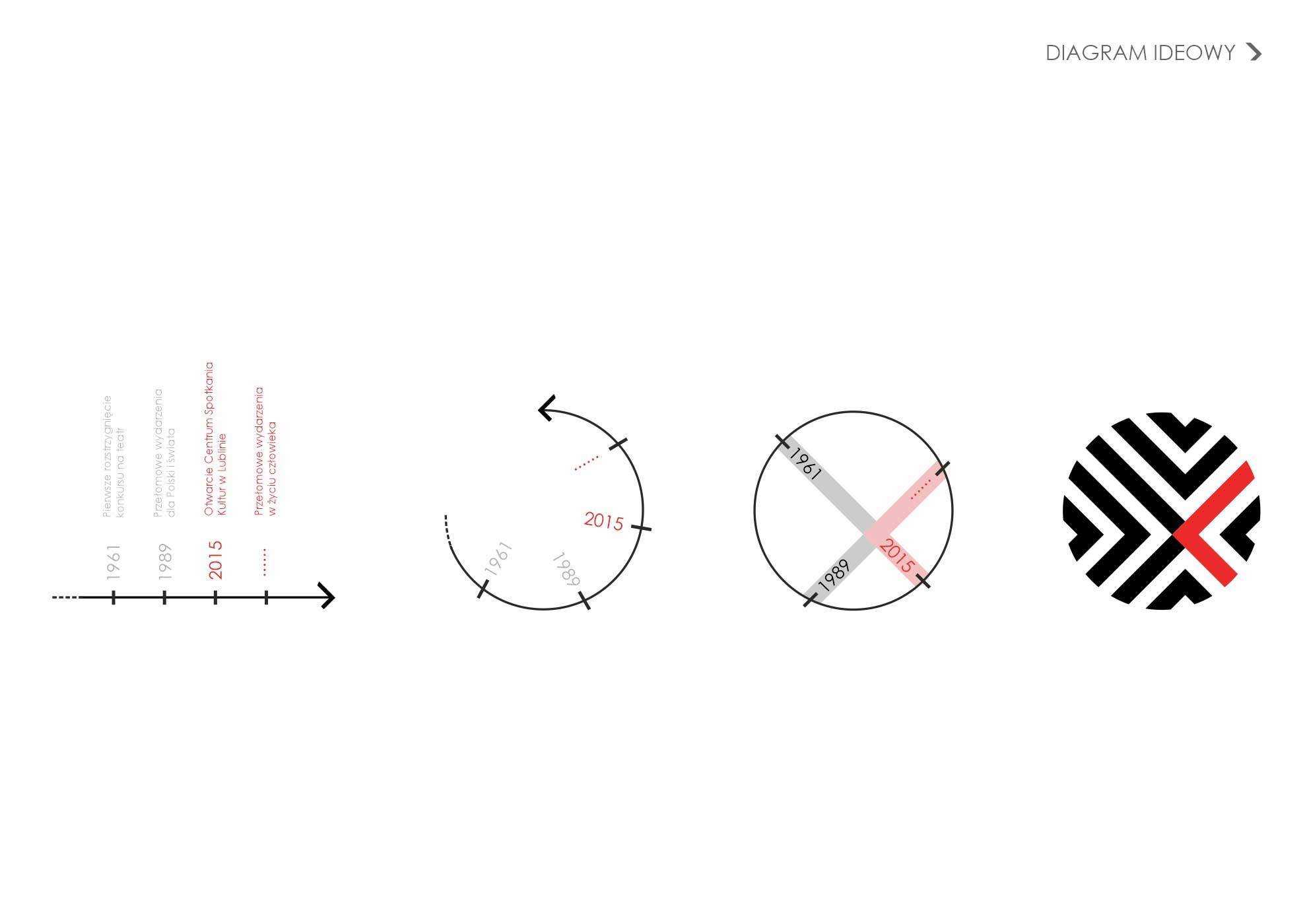
The logo design for the new institution refers to the history of the place, which is implemented in the new architectural design of the building. Characteristic and significant historic events are the basis for culture shaping and its development. They influence each other in different ways, just like intersecting directions – elements of our designed logo. Two overlapping directions meet in a common center. In the same way as past and future cultural testimonies meet in building.
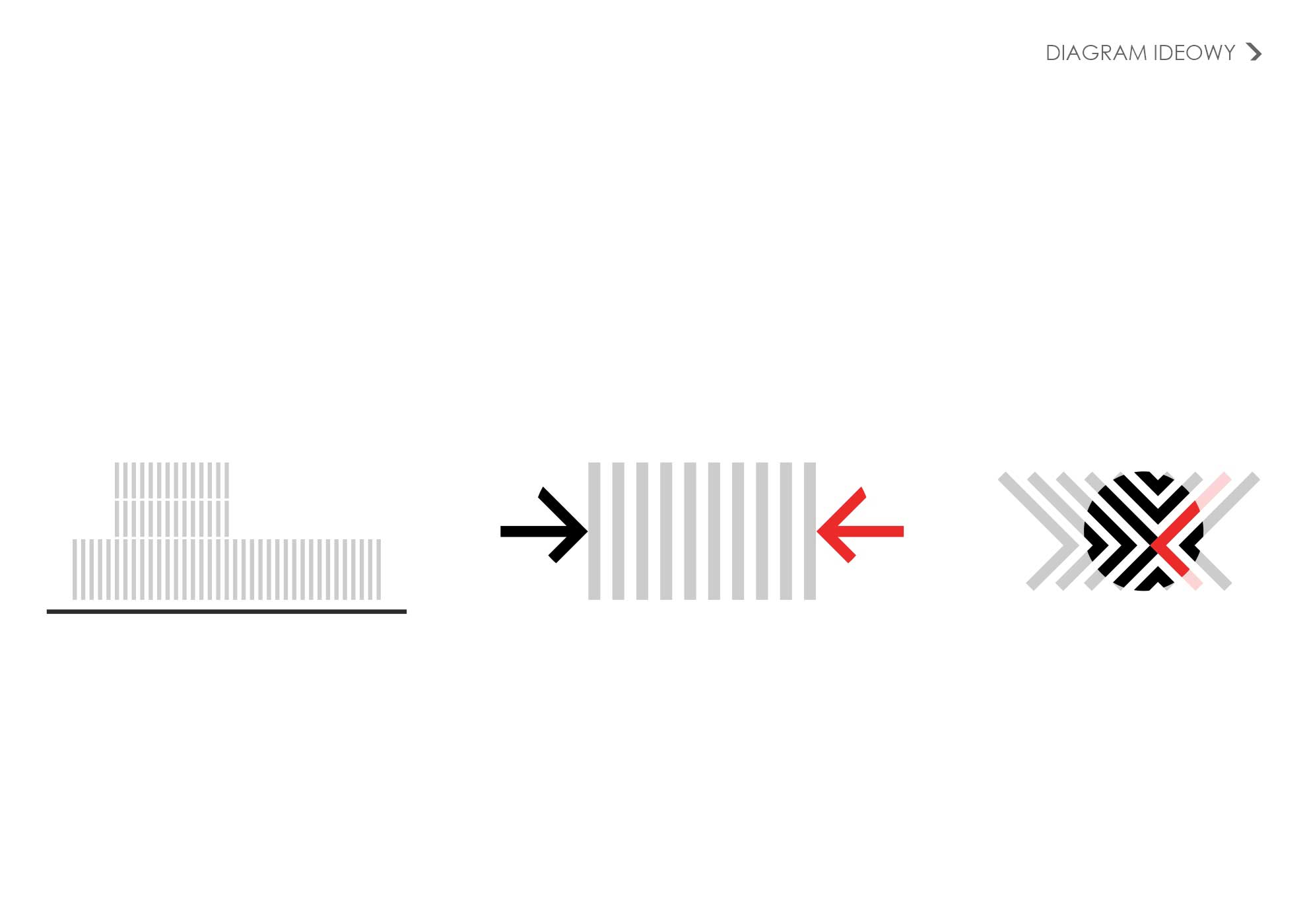
The Culture Meeting Center will create an atmosphere of creativity and social closeness, attracting its interior with its rich program. The logo concept responds with this aspiration through approaching directions that meet in the center, just like participants of various events organized by the new institution. The four directions of the lines refer to multi-voices, diversity, and various initiatives.
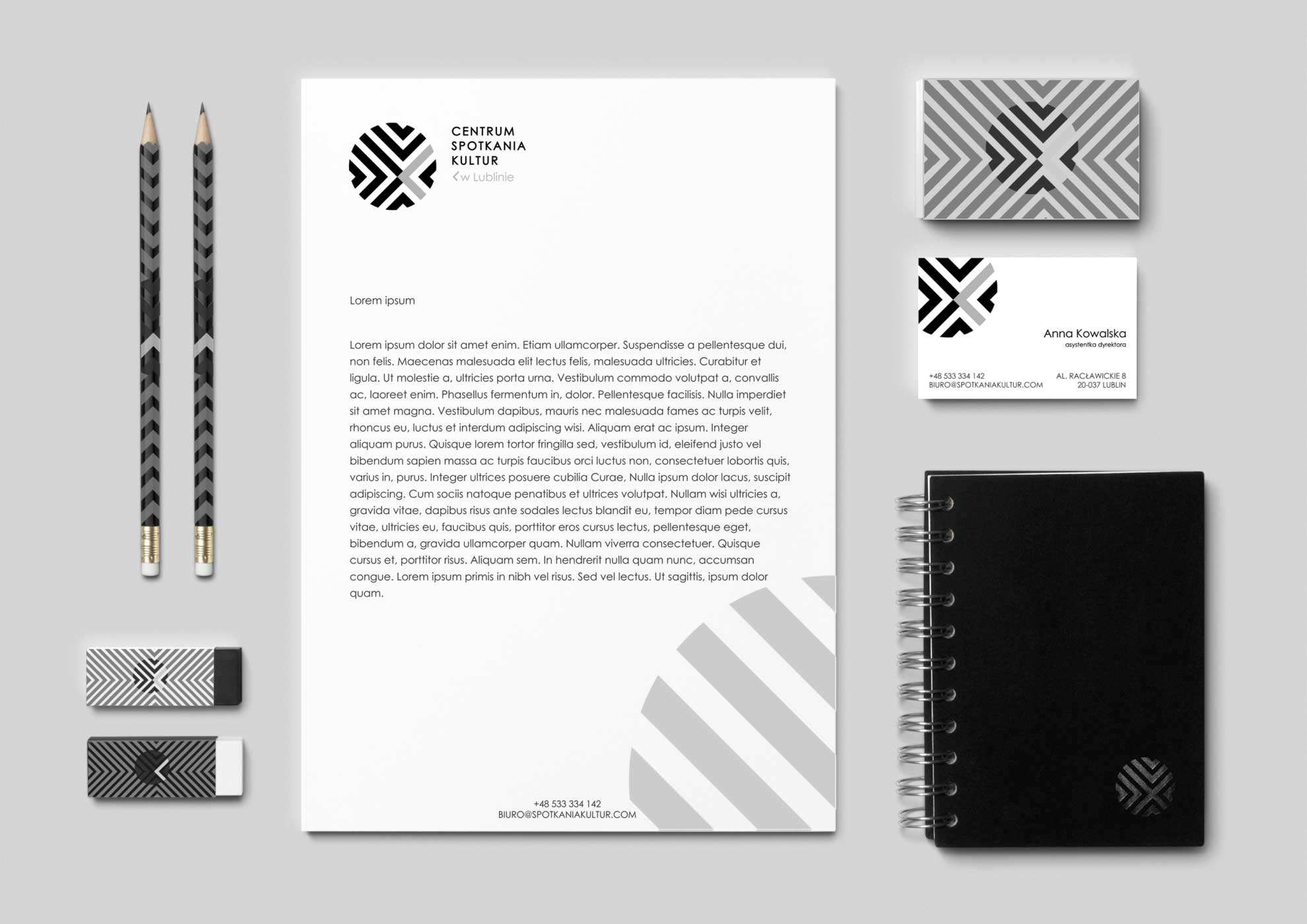
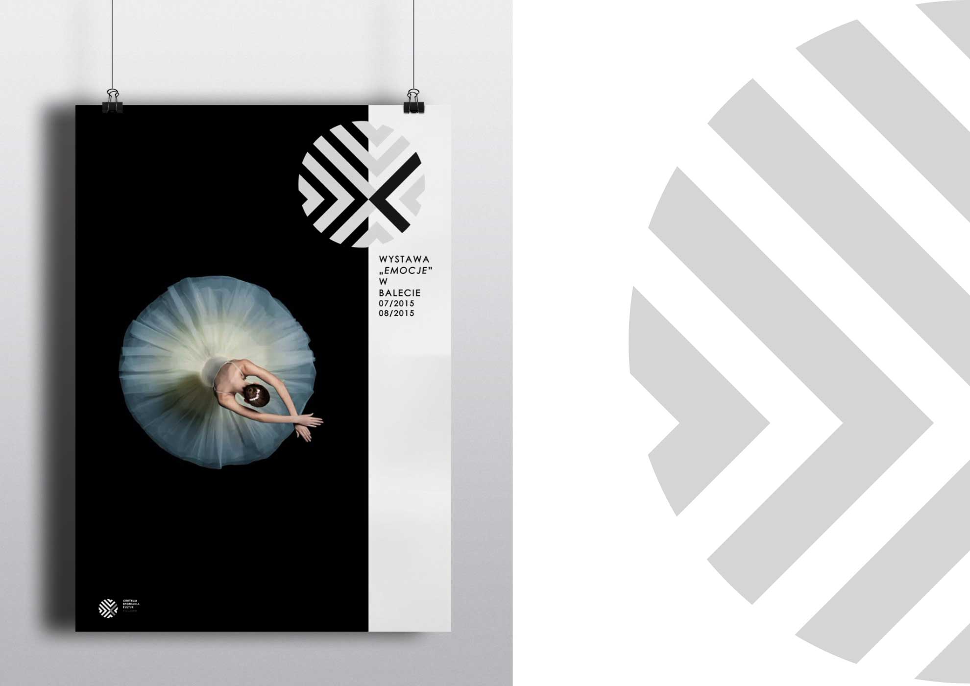
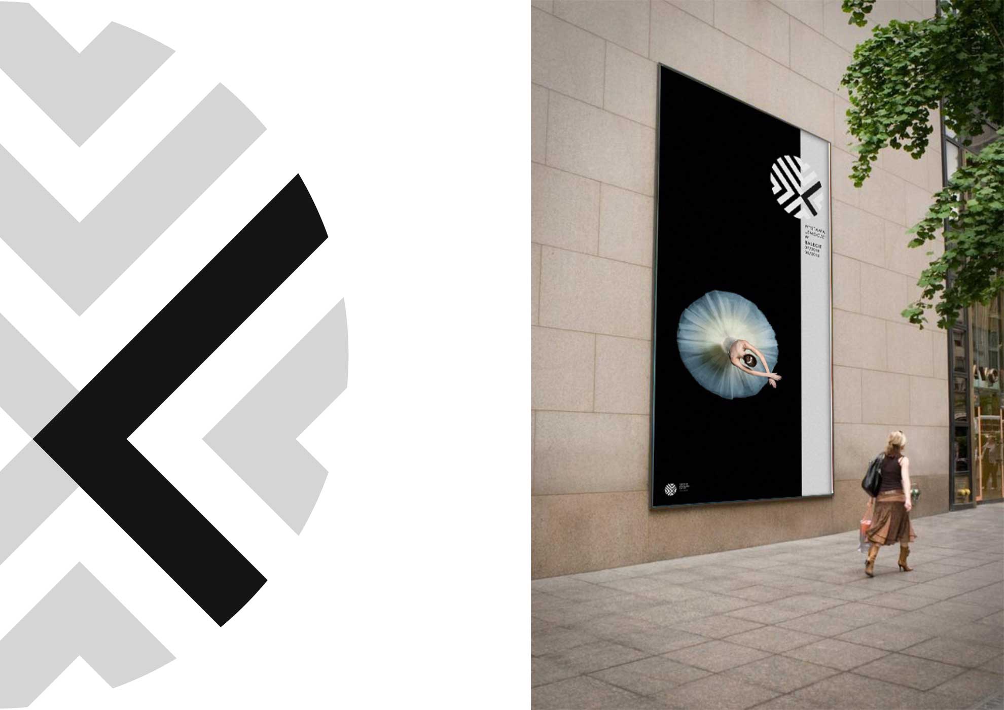
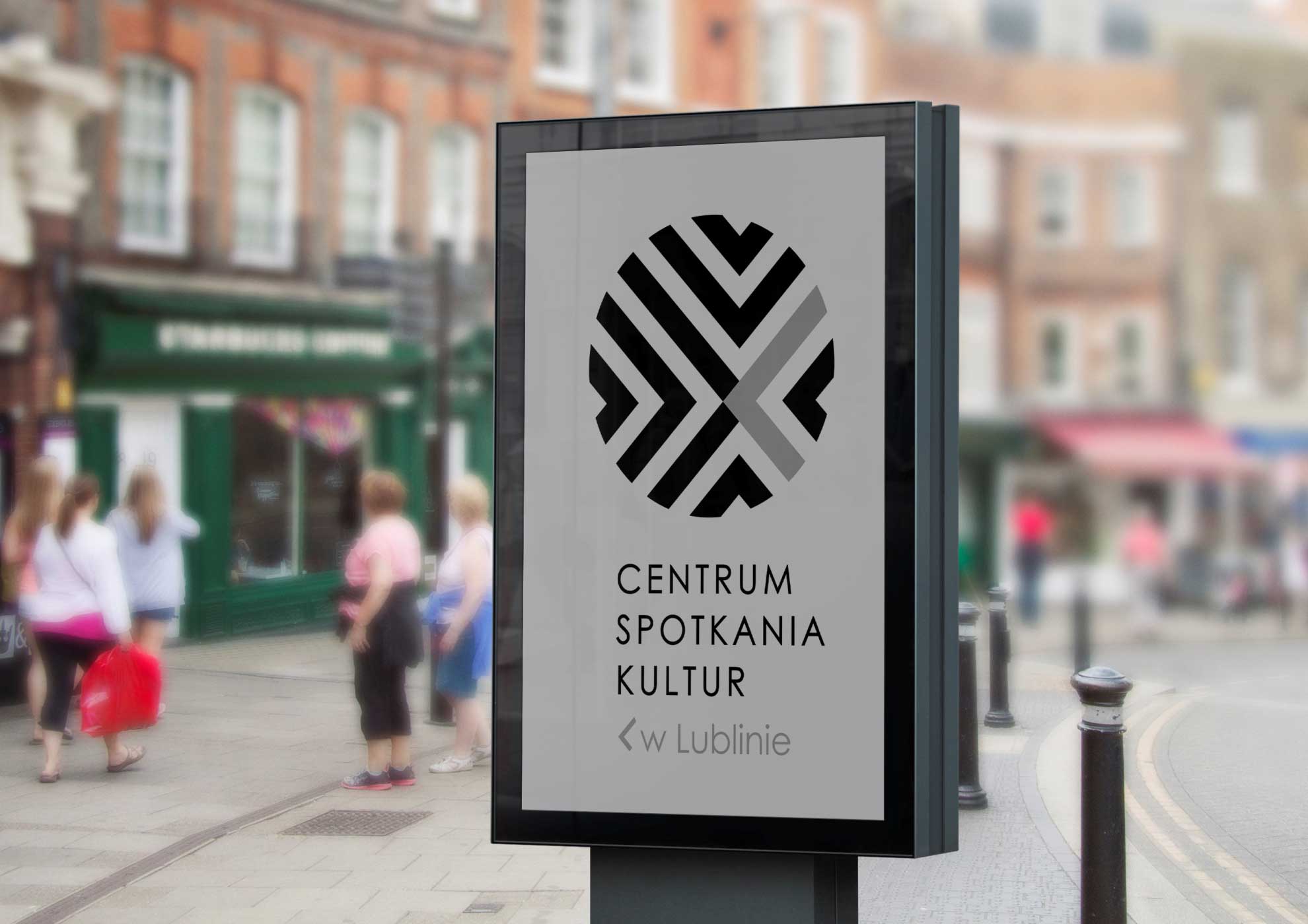
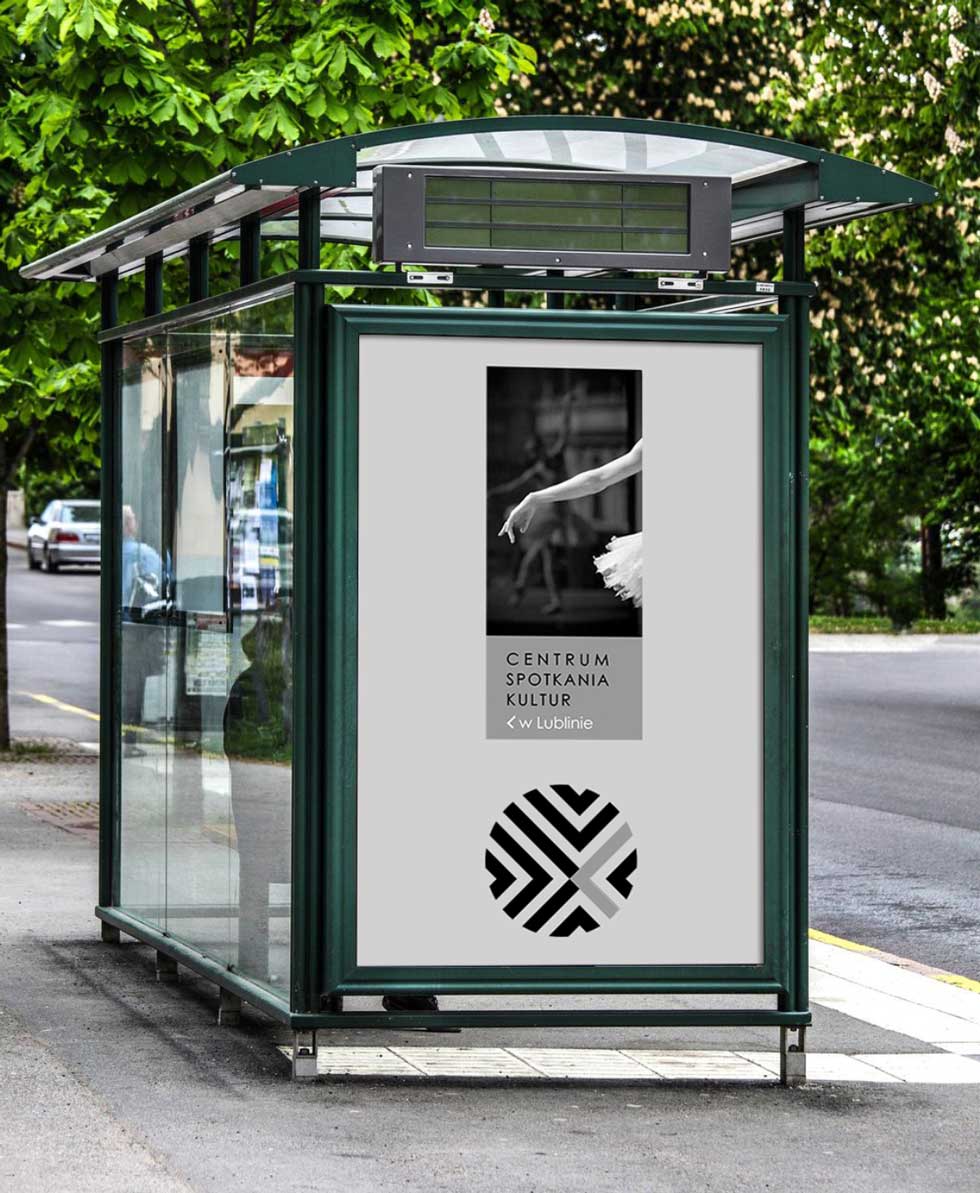
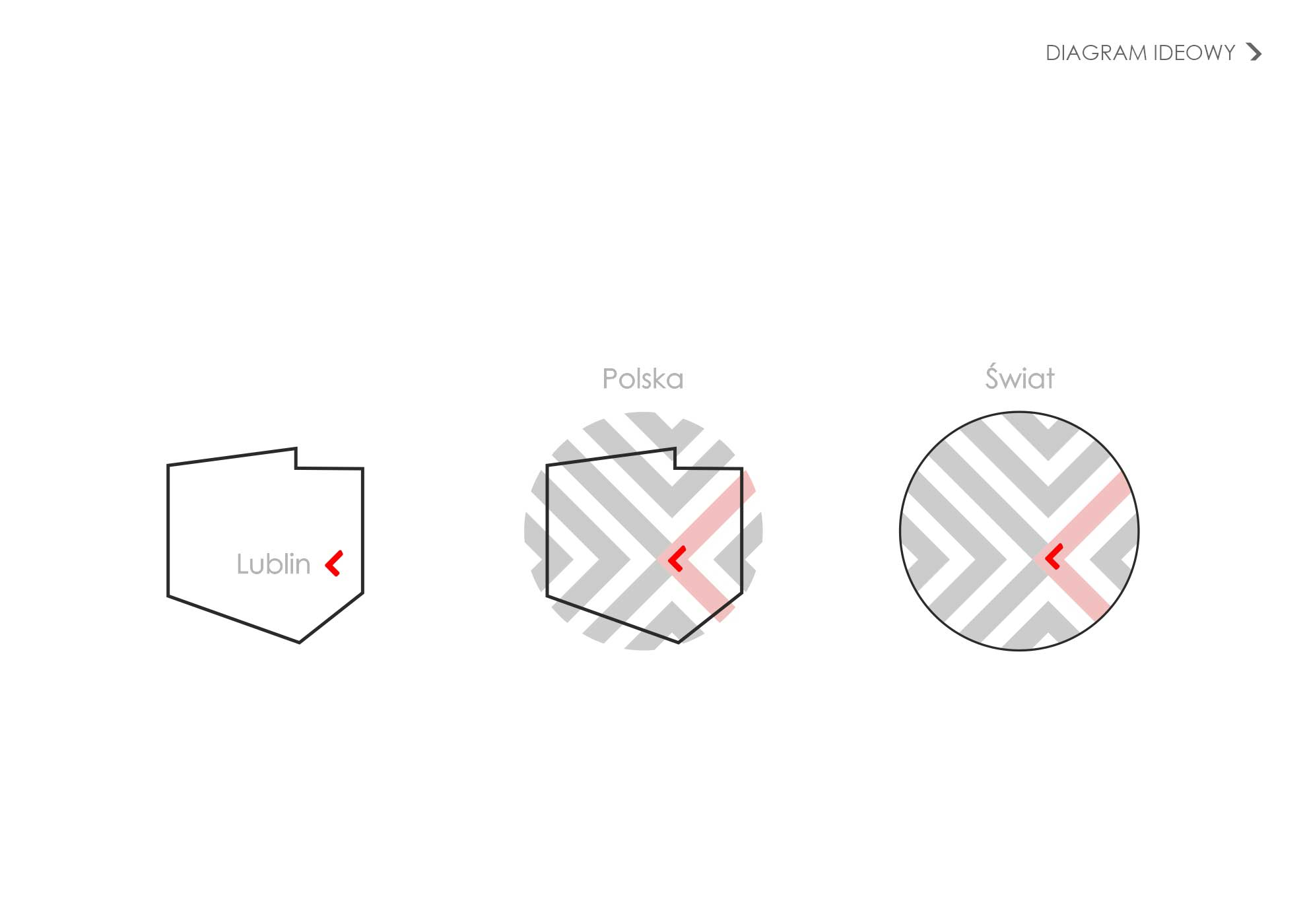
The center of the logo that stands out in terms of color means openness to diversity, to seeking new paths of dialogue. It emphasizes the availability of institutions for everyone and readiness for modification by new generations.
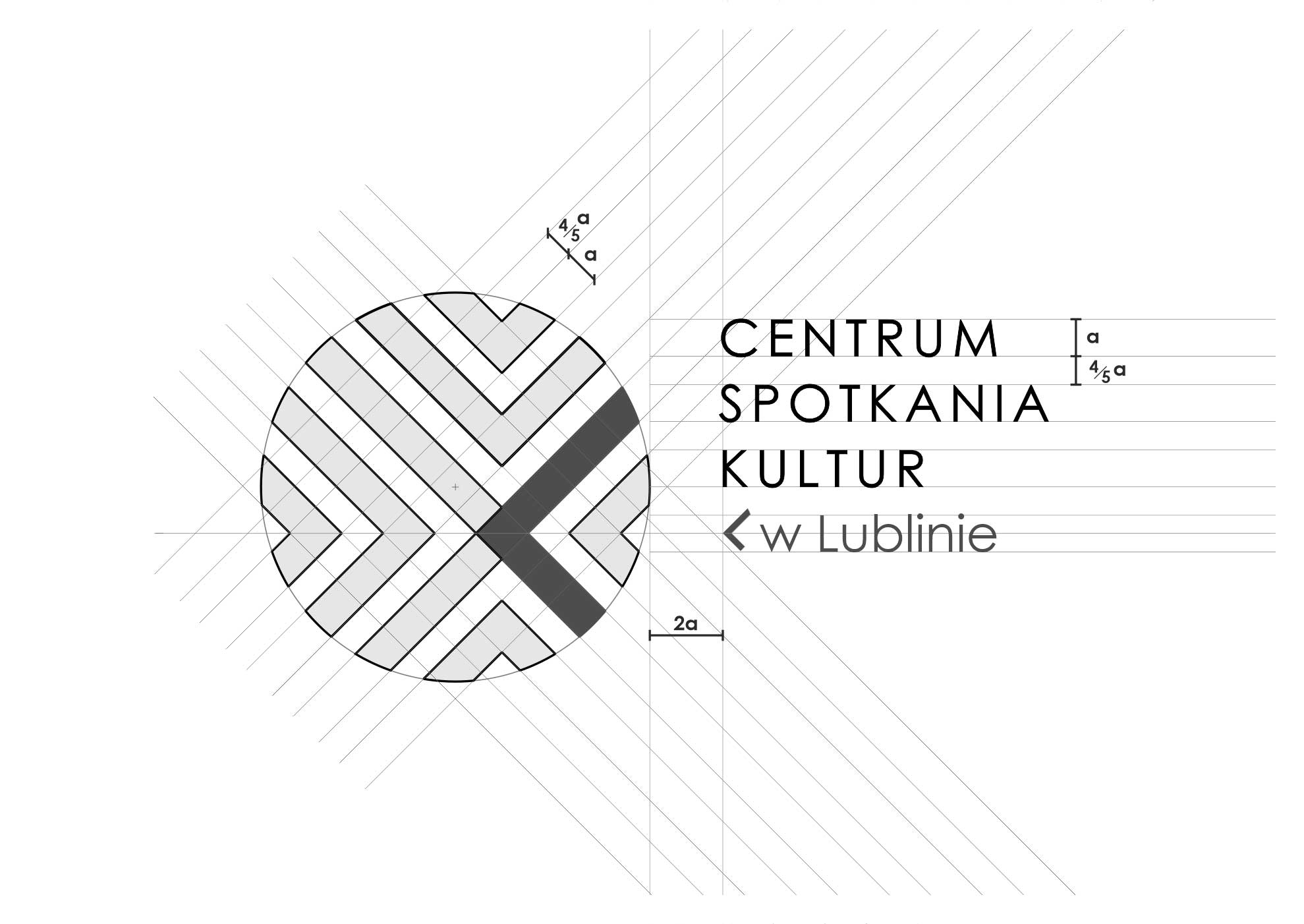
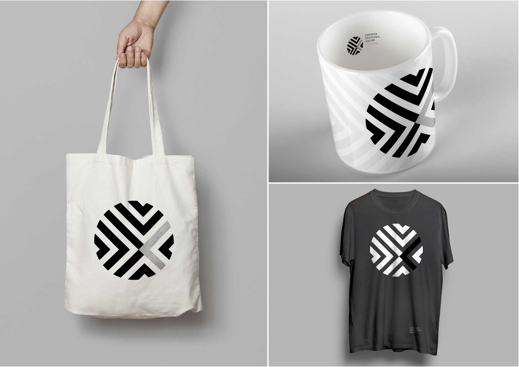
The designed logo has a dynamic form. The selected proportions of shapes – directions, are expressive, and the symbolic content that the logo should convey, as simplified as possible. The logo located on various elements, from prints to advertising posters, is easily noticeable and positively received.
