Interior design
-
Mi Bella Salon Urody
-
photo – Jakub Nanowski
Author
-
Marta Komorowska
-
Bartosz Koszałka
Location
-
Zygmunta Działowskiego 27, Gdynia
Area
-
80 m2
Status
-
Completion 2021 r.
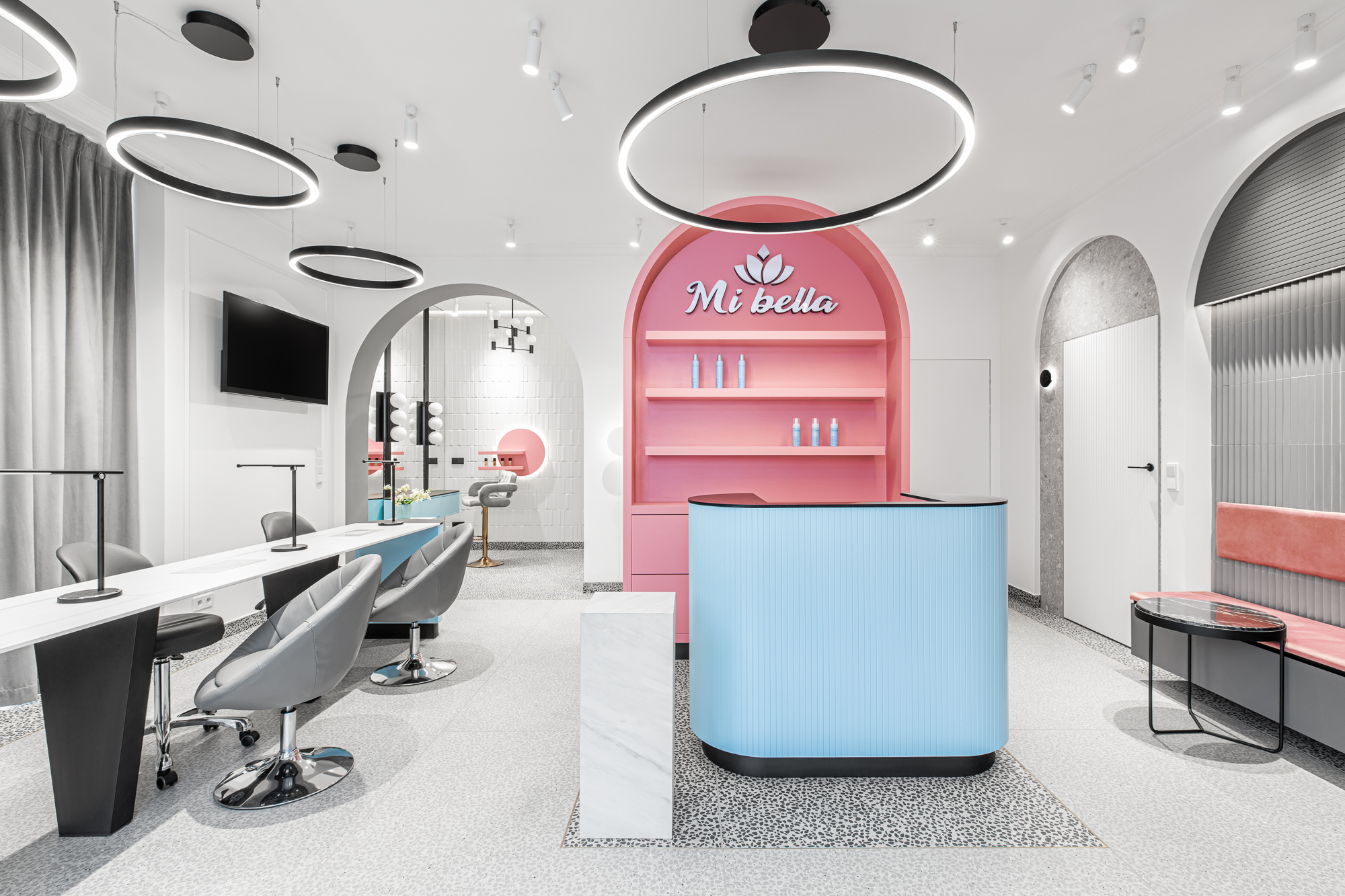
Mi Bella Beauty Salon is located in Gdynia – city known for its modernistic approach towards architecture. This style gave rise to beautiful and human-friendly architecture, creating previously unknown comfort of living and working. We strongly believe that architecture should be closely connected with the surroundings of the city or landscape. Then, the project is unique and has identity that people can refer to. Our project can be characterized by mix of primary and pastel colors, geometric shapes and bold, repetitive patterns combined with arches. Our desire was to reach deeper beneath the surface of the objects and to create space that is harmonious and in no way boring.
The structure of a designed space is determined by specific and required functional areas. 80 square meters include common open space that consists of reception, waiting area, manicure and make-up. In addition, there are two spa rooms and toilet for customers.
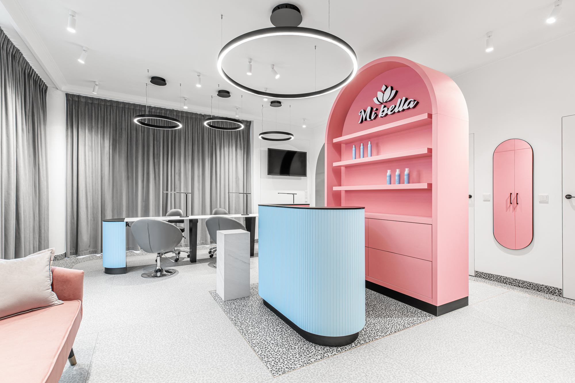
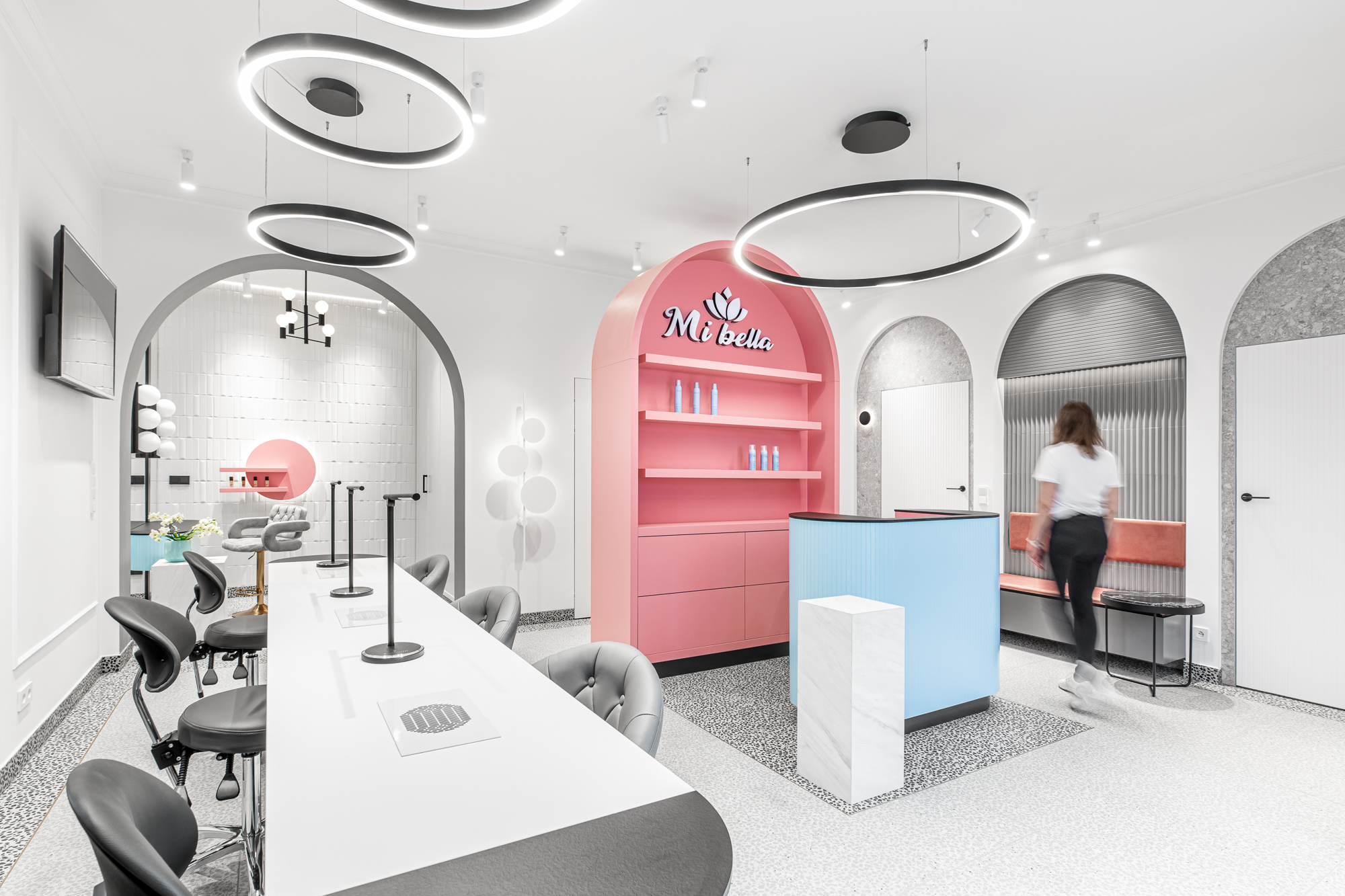
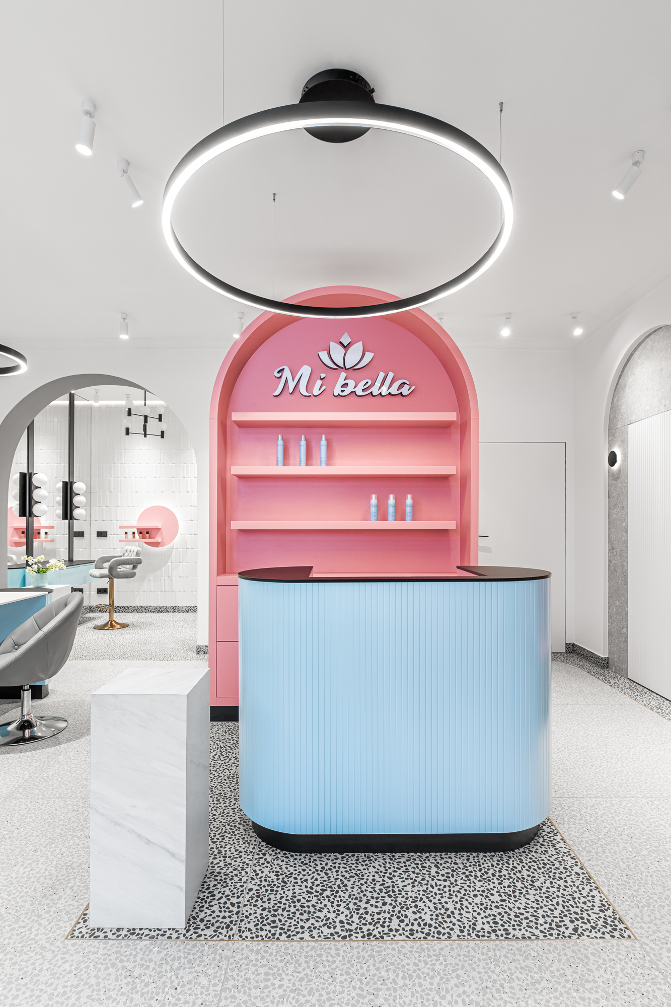
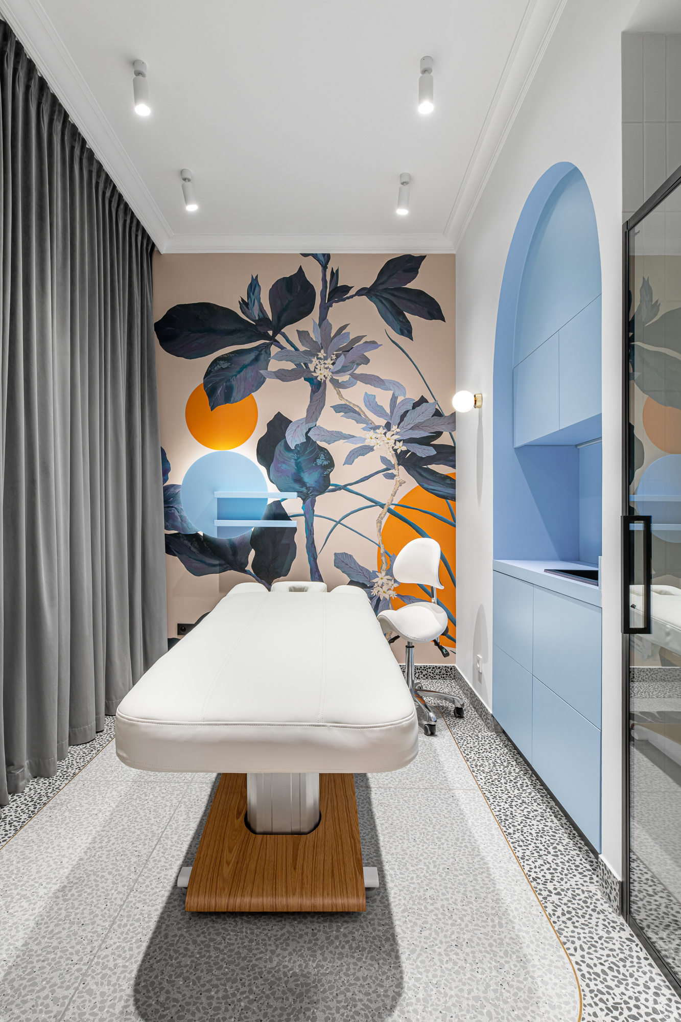
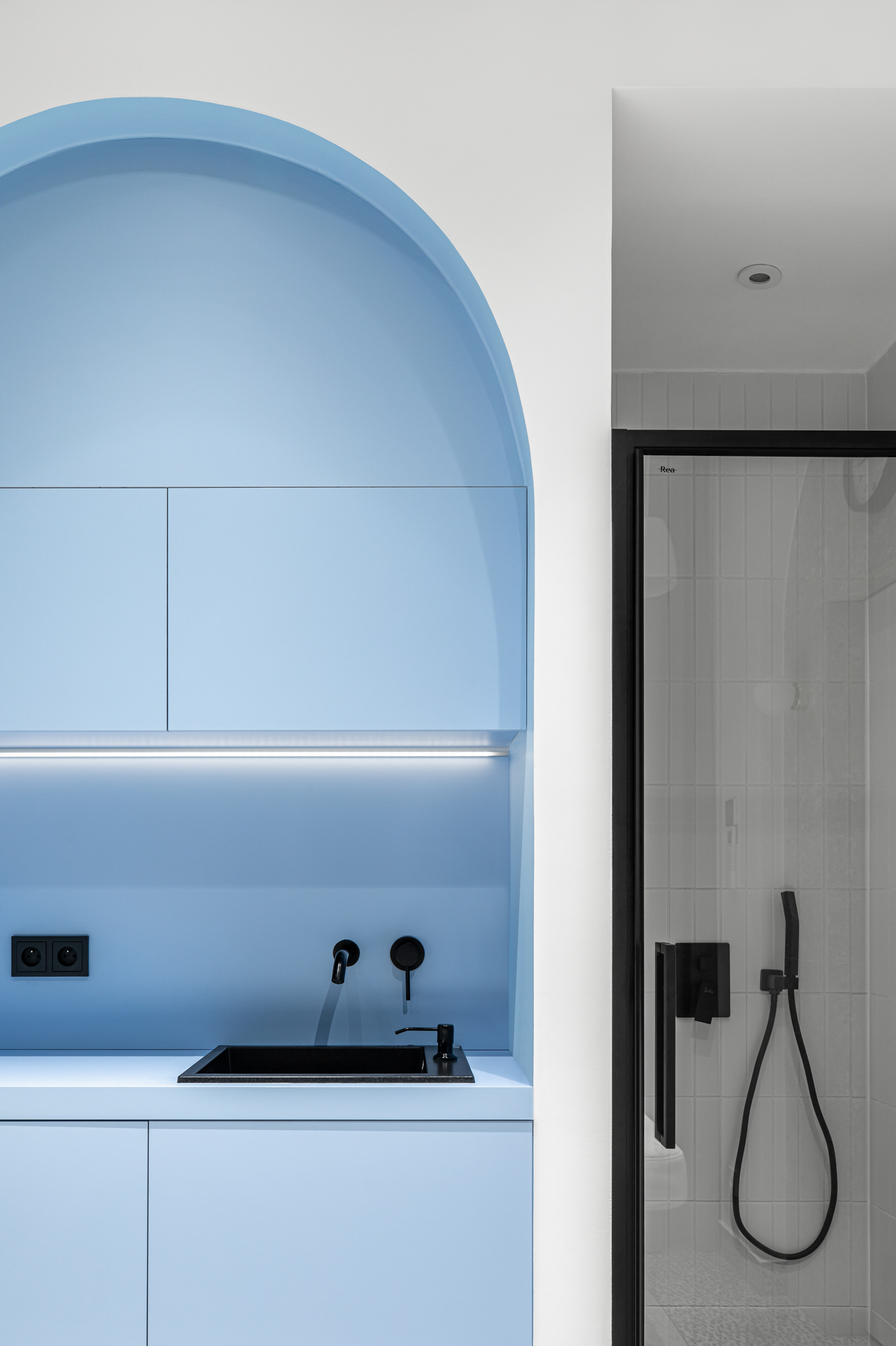
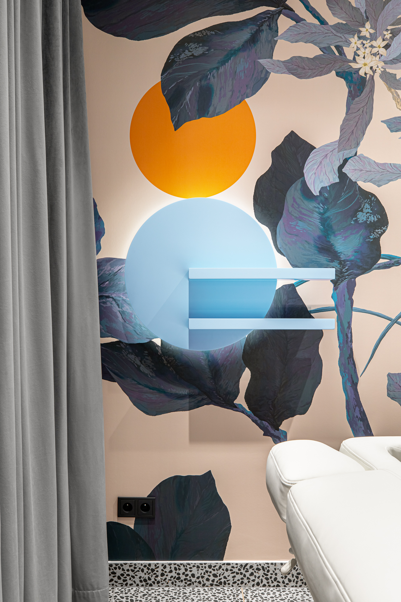
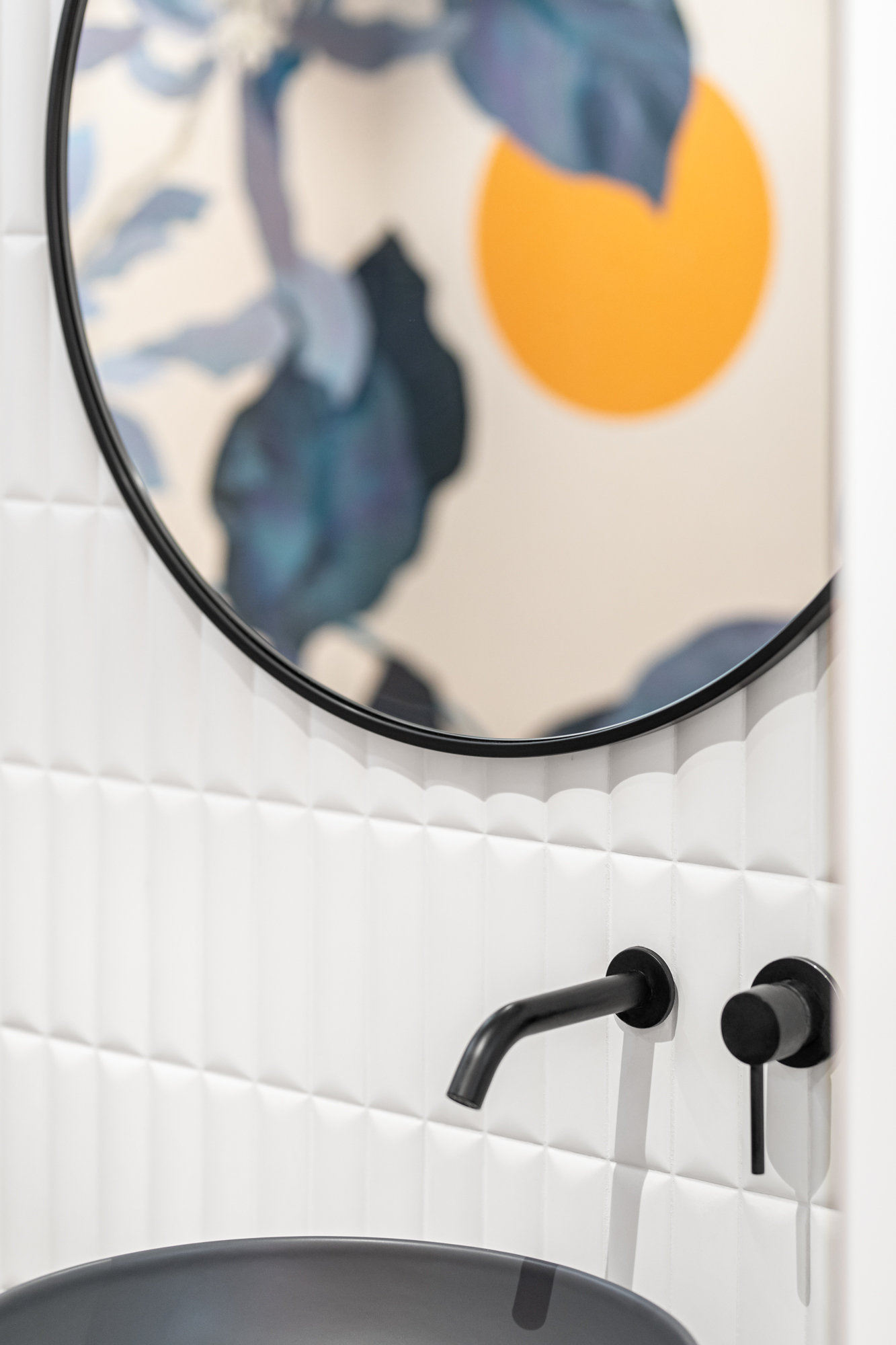
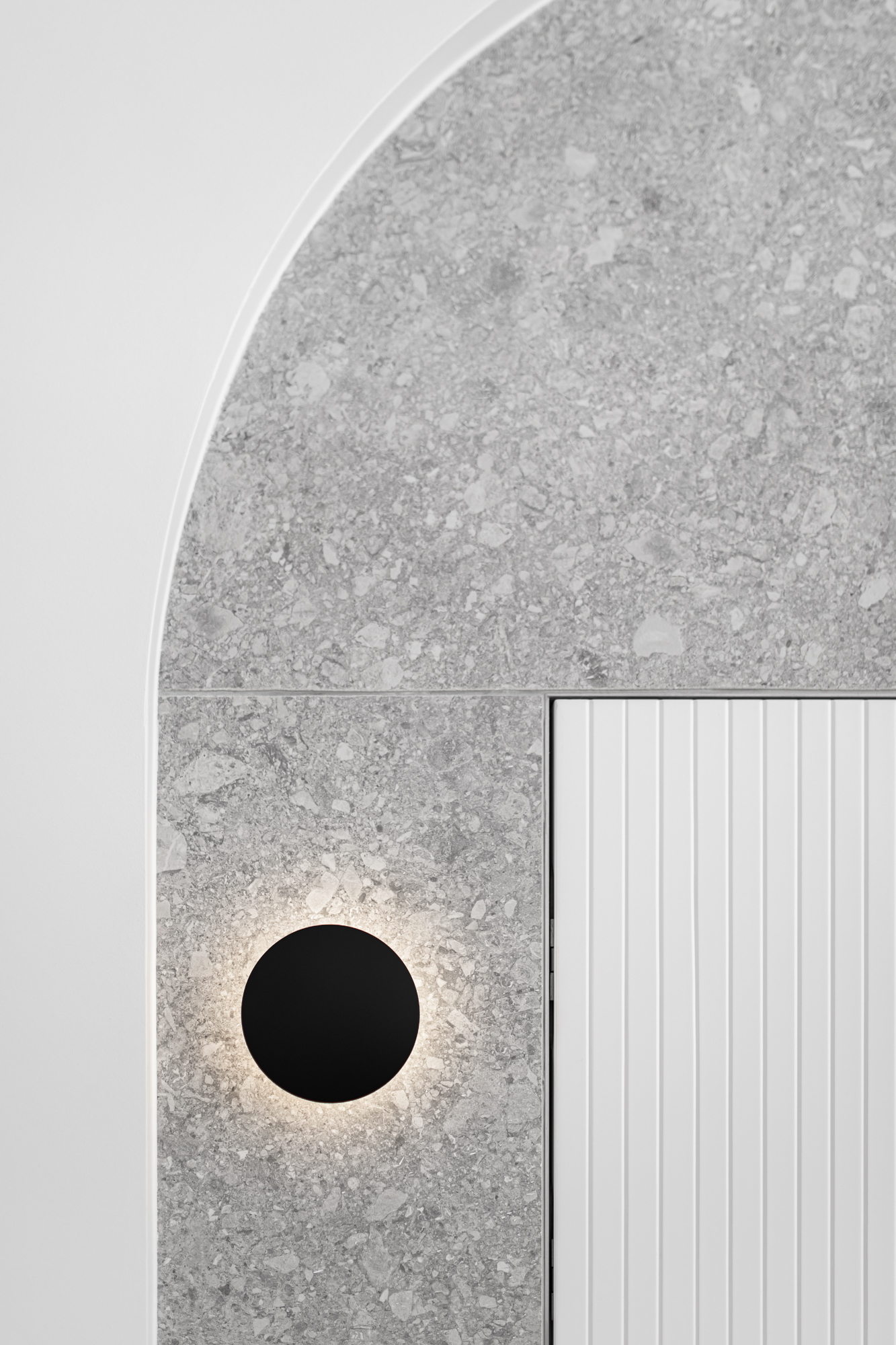
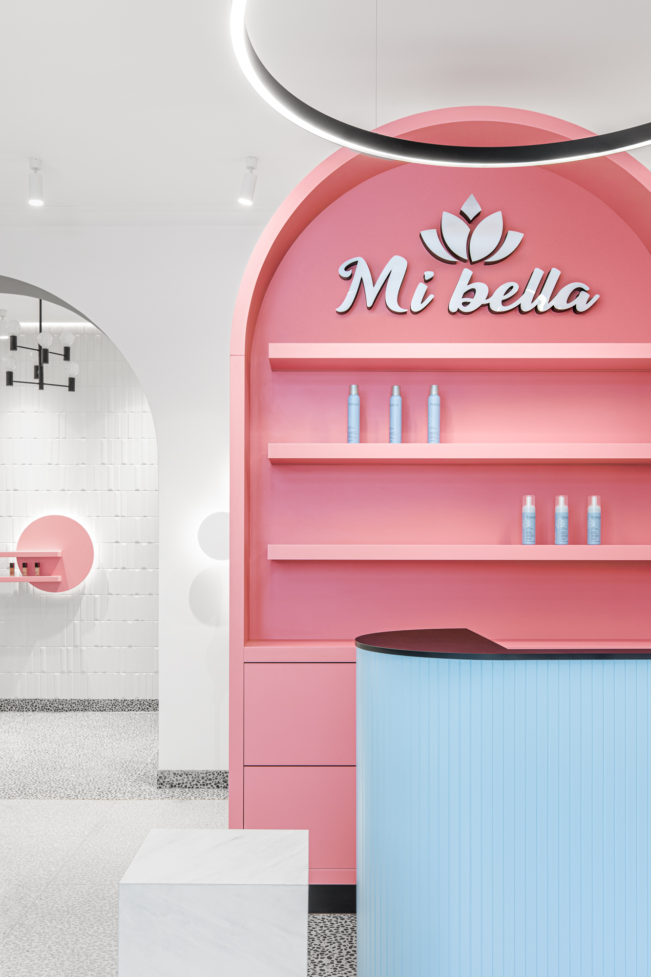
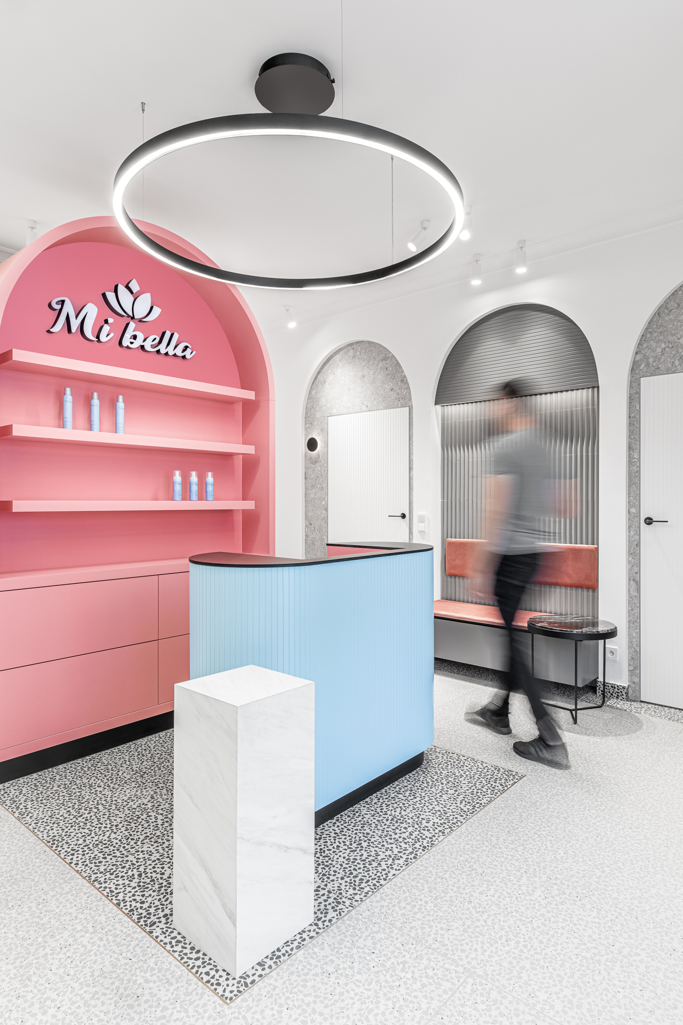
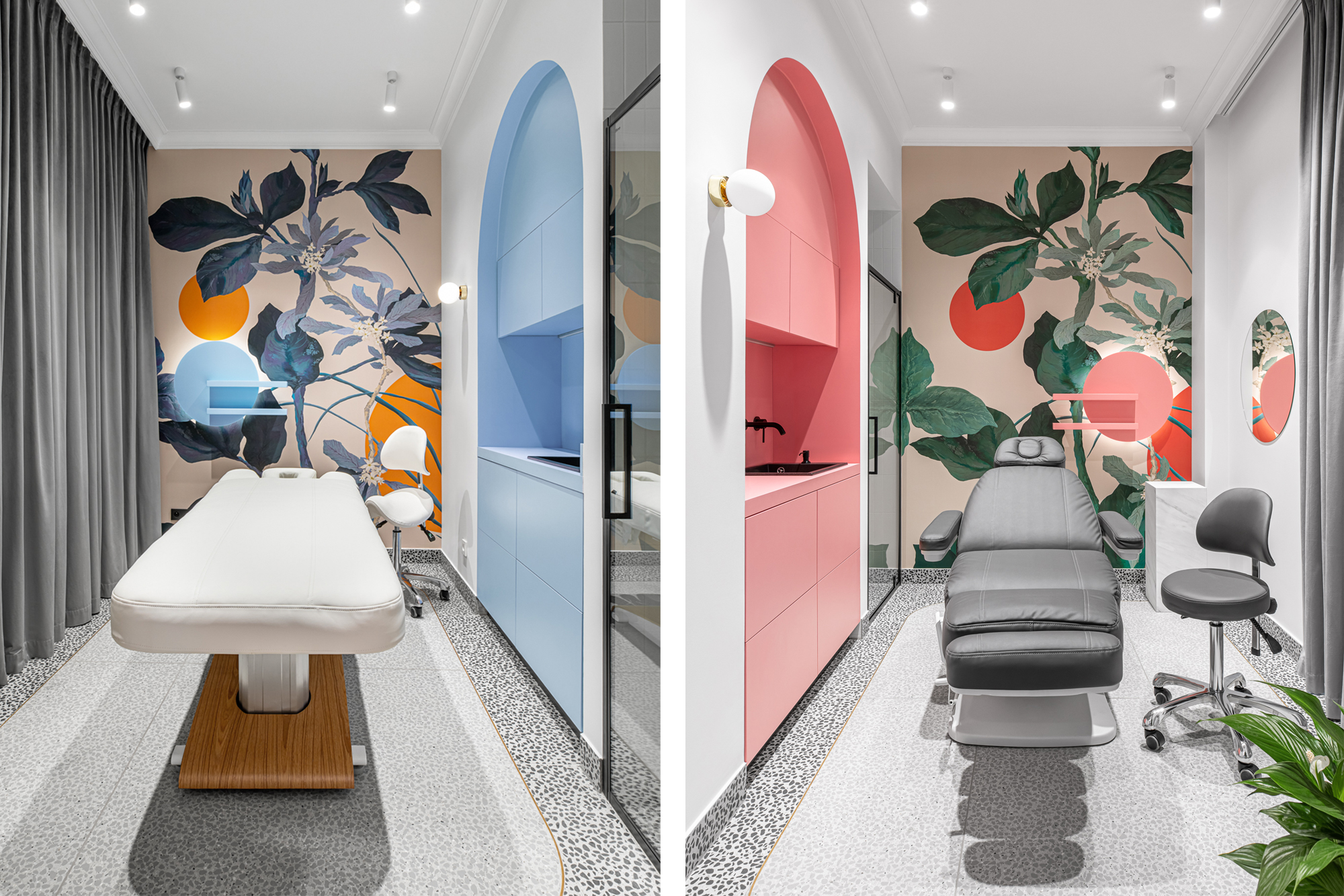
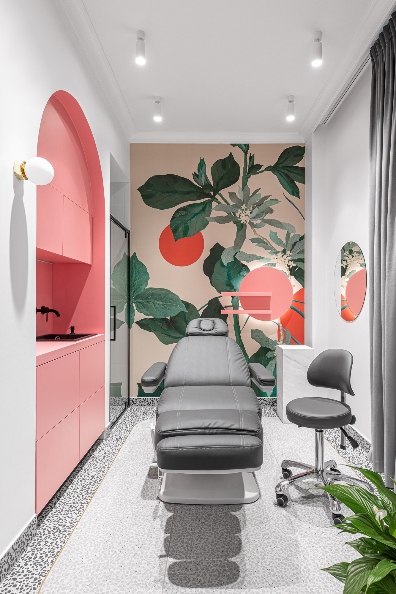
The predominant colors are light pink and blue, which contrast with the monochrome floors and walls. The use of round shape furniture and arches is a powerful statement of the design and concept of this project. It creates a playful environment with rhythmic repetitions, proportions, niches and details that are eye catching and strongly define each space. Round shapes are emphasized by different kinds of lighting and colors used in this project. Ovals, roundings and arches will work well in both extremely modern interiors, as well as those in the spirit of minimalistic style.
Our desire was to create one open space that guarantees the same experience for everyone in the salon.
Our desire was to create one open space that guarantees the same experience for everyone in the salon. For this, we created a large manicure table and open make-up niche where customers and professionals can exchange views. It was important to create furniture that can be used in multiple ways. It’s about ensuring accessibility, comfort and purpose. Like, the reception desk that has other functions apart from greeting guests as they come or answering phone calls. It displays beauty products for sale and from the the other side has a space for customers coats.
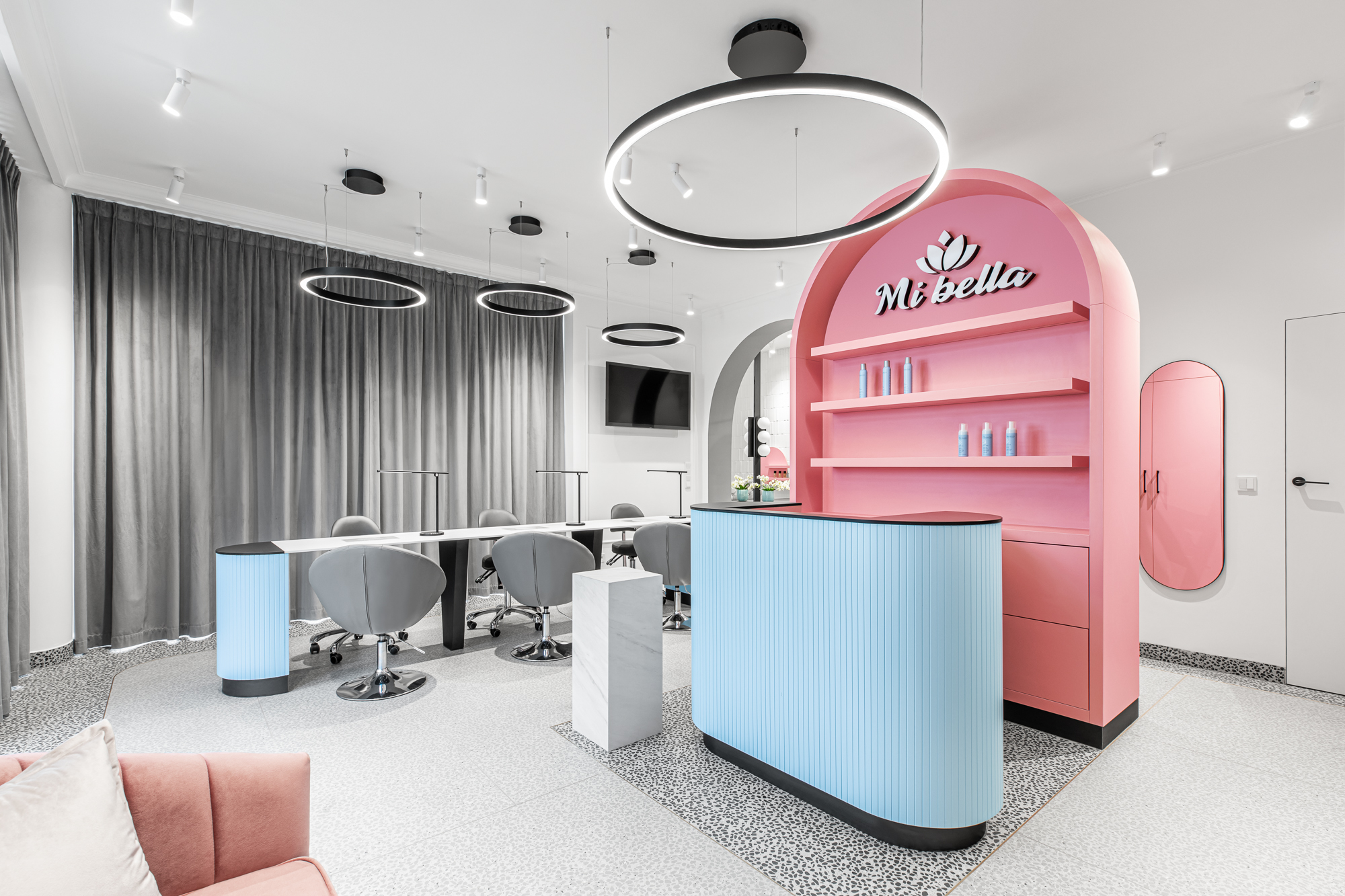

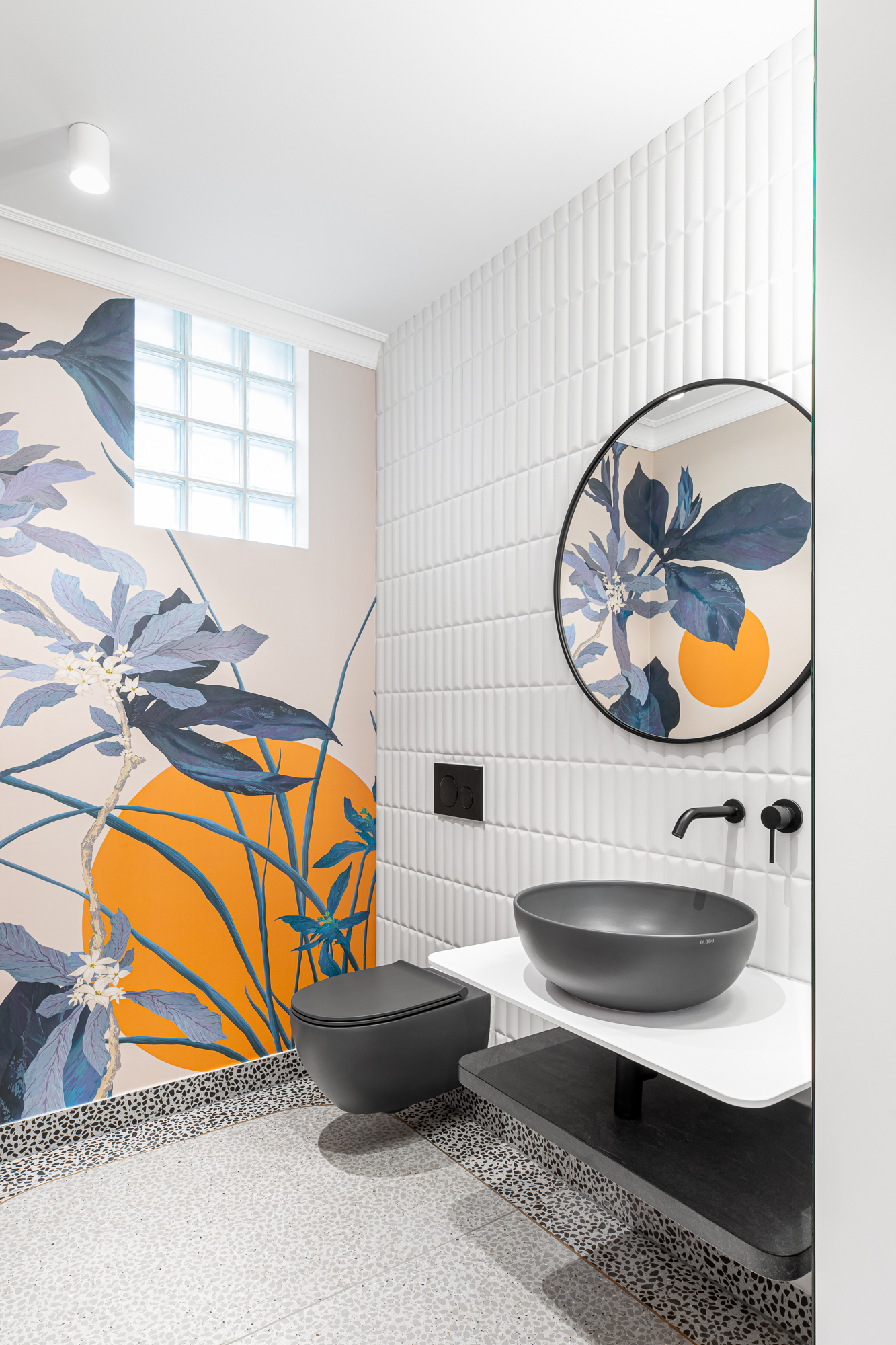
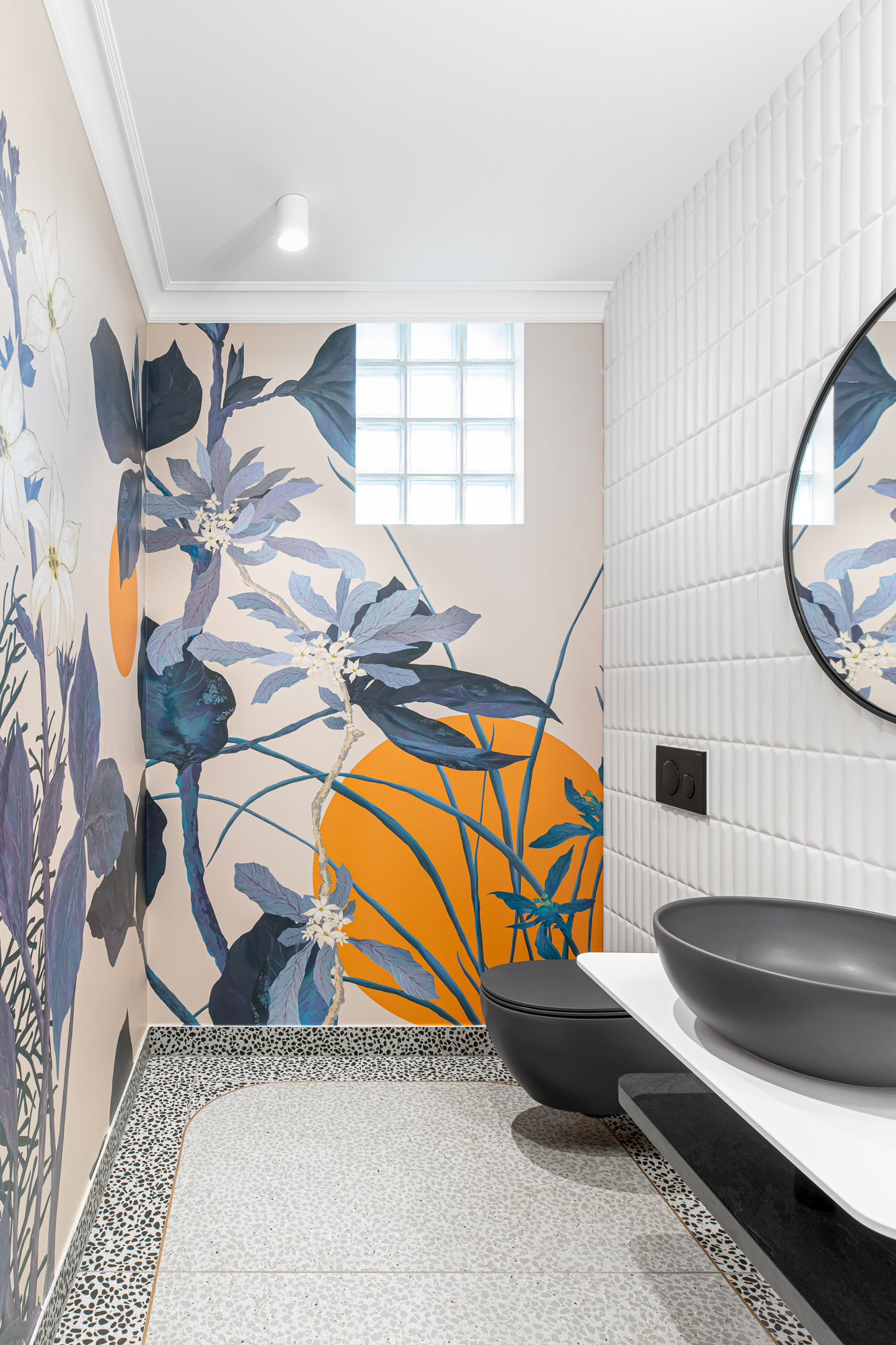
Each spa room has its own individual, principal color – light pink or blue and therefore floral wallpapers are specifically designed to enrich those colors. In this area, customers should relax and forget about everyday worries, that’s why the climate of the interior is such an important factor while designing. The project can be described as a play of colors and light. The design seeks to maintain a coherent language incorporating all the necessary elements that enhance work like luminaires that guarantee linear and equally distributed lighting for the services and furniture that was designed with attention to detail and work ergonomics.
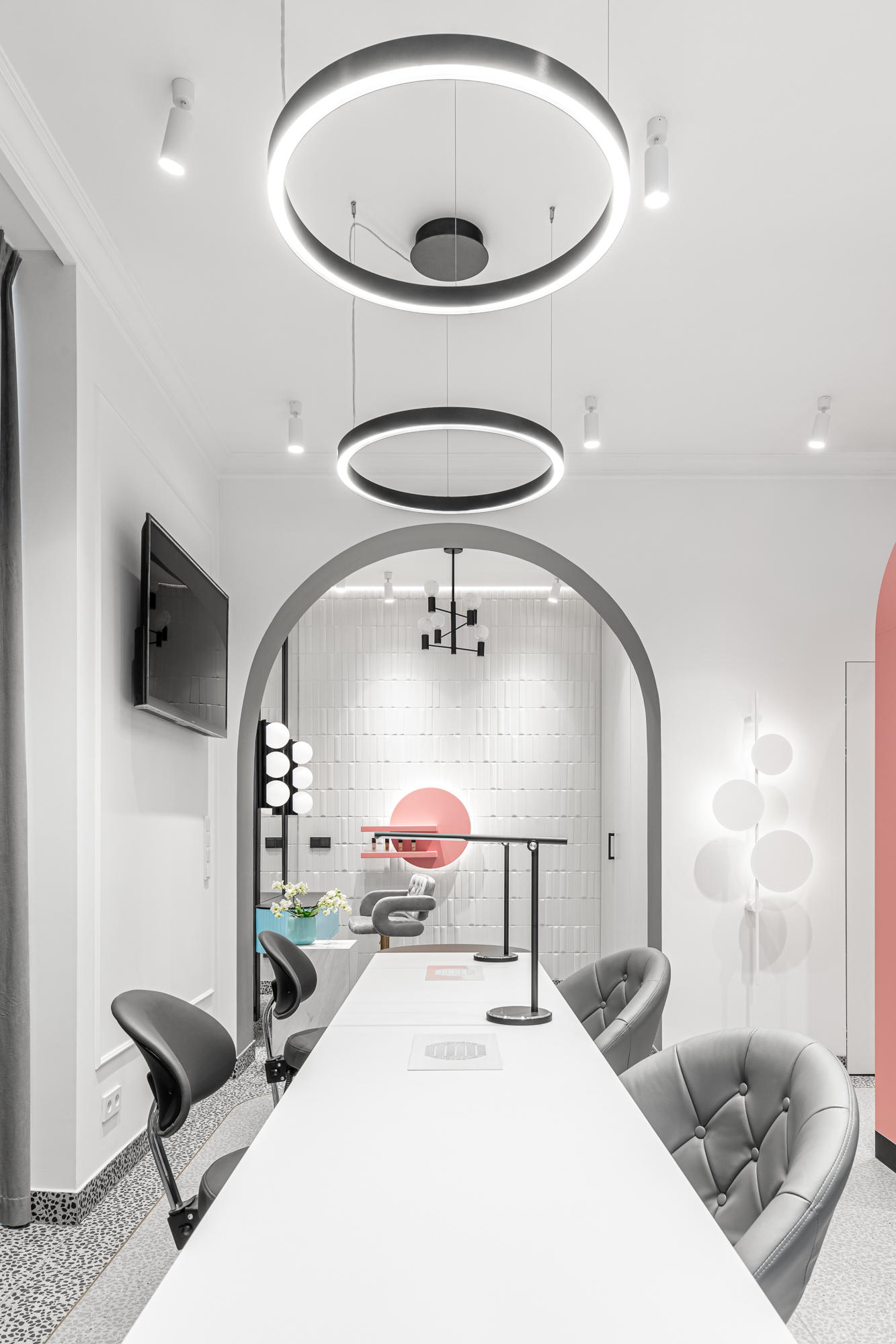
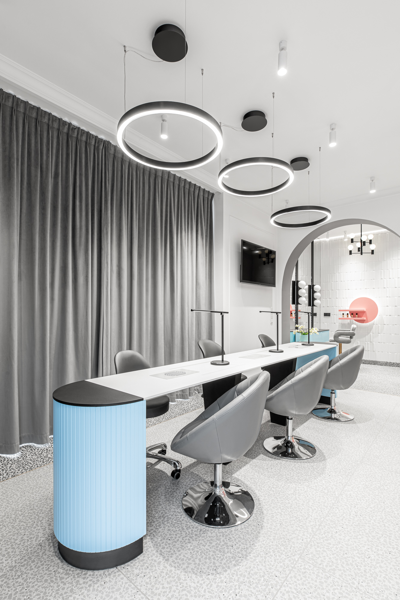
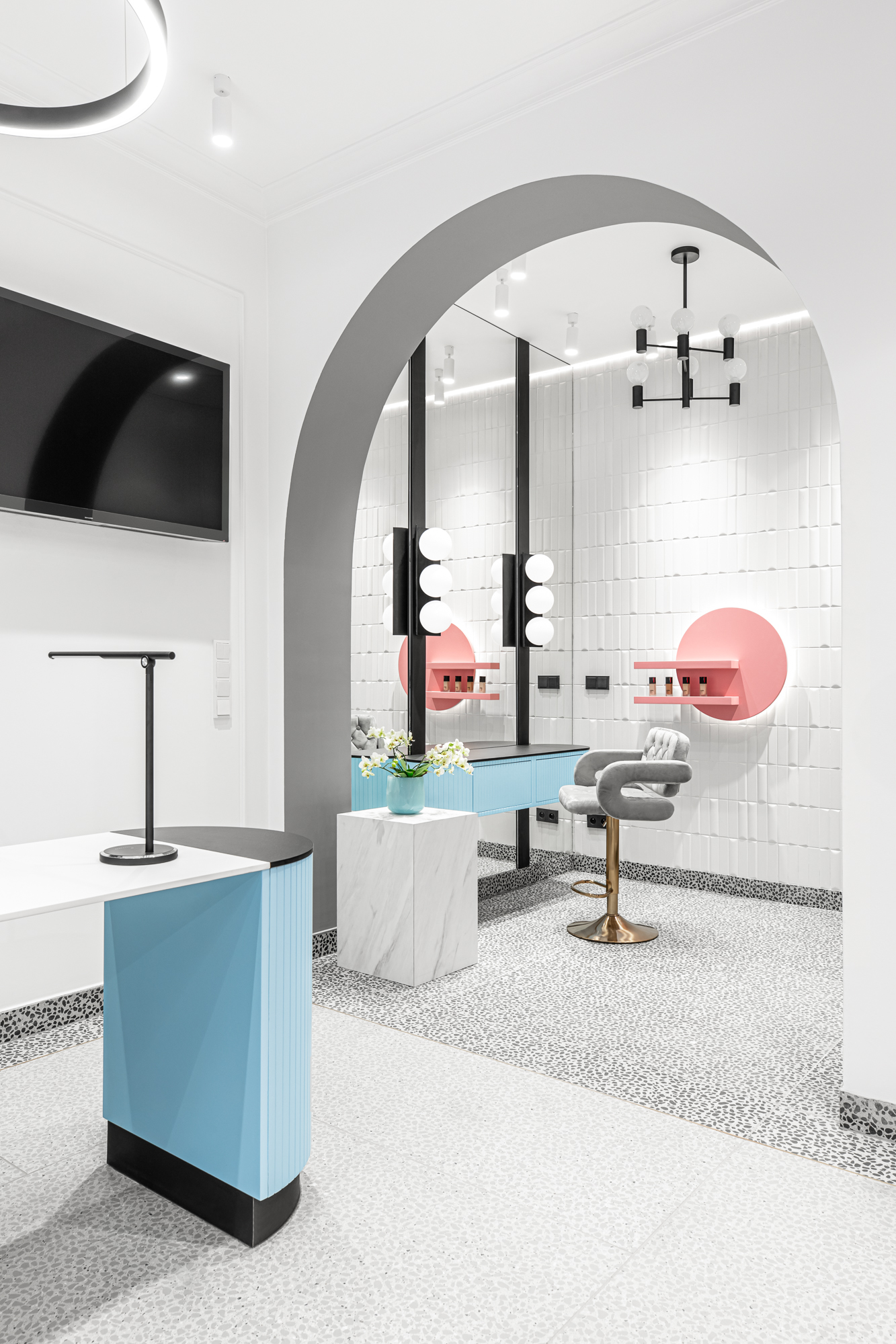
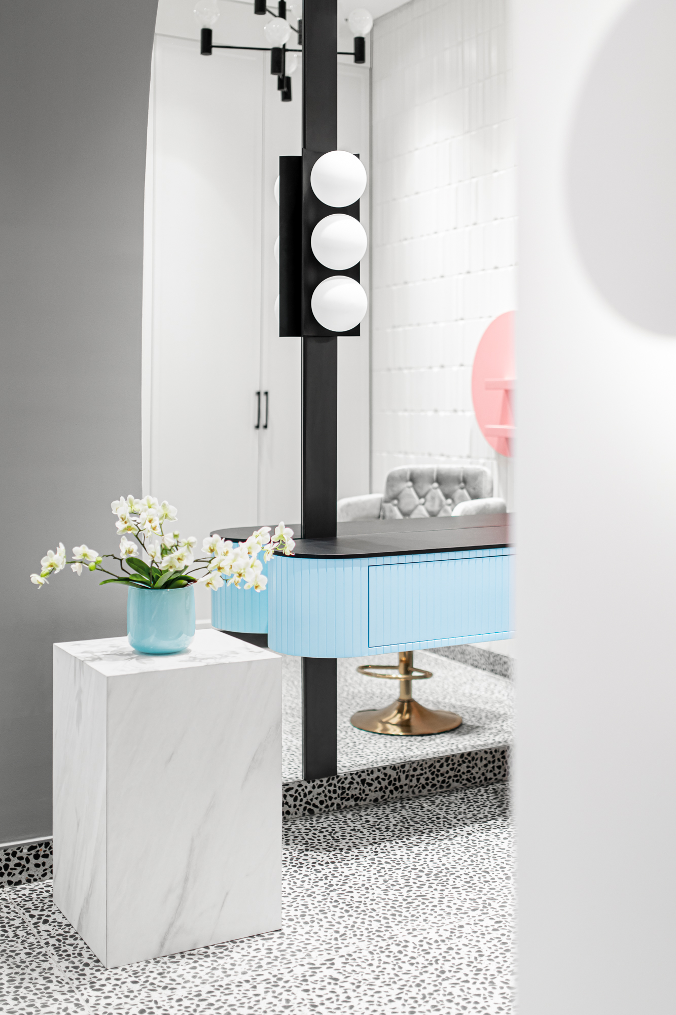
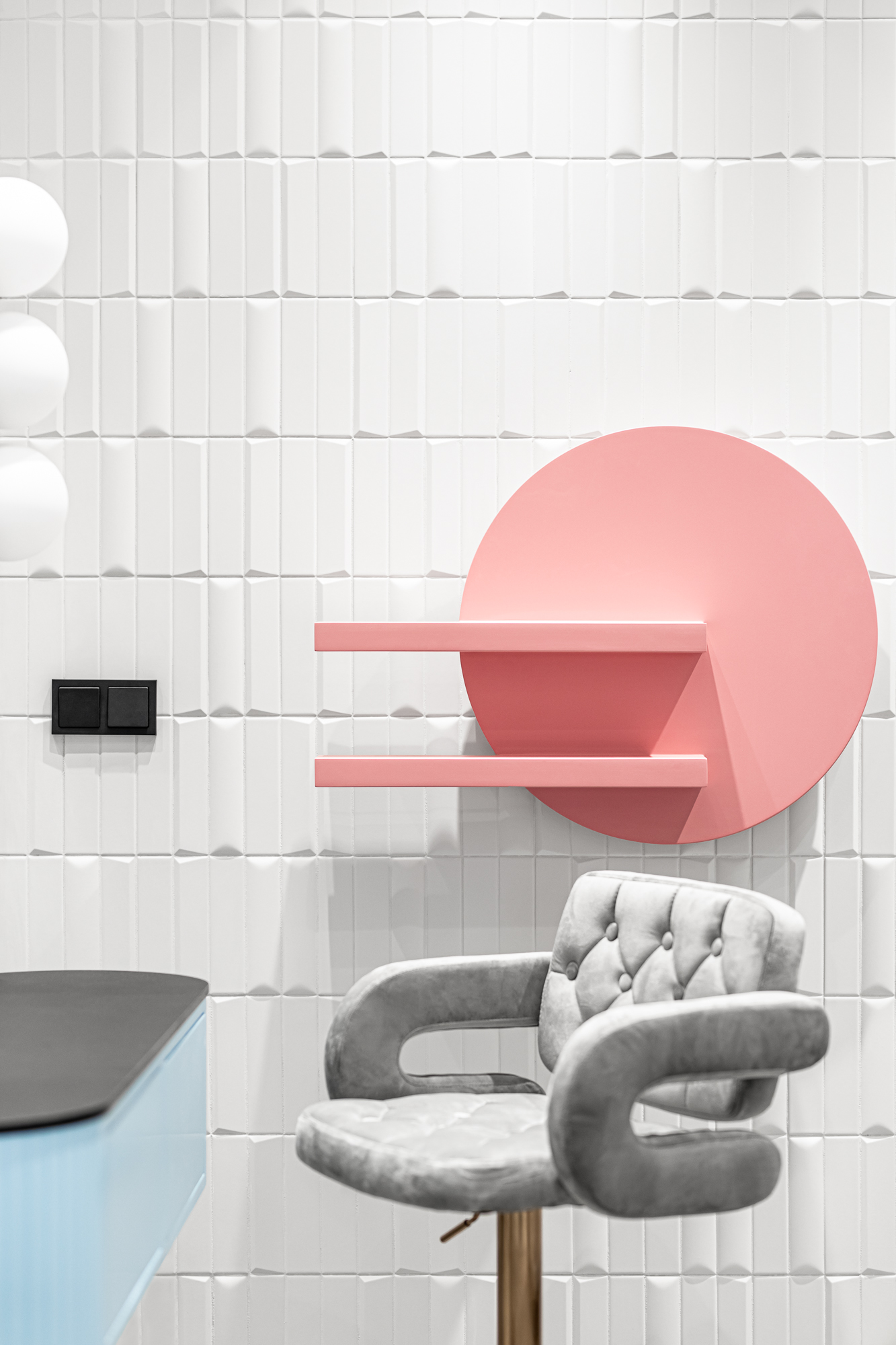
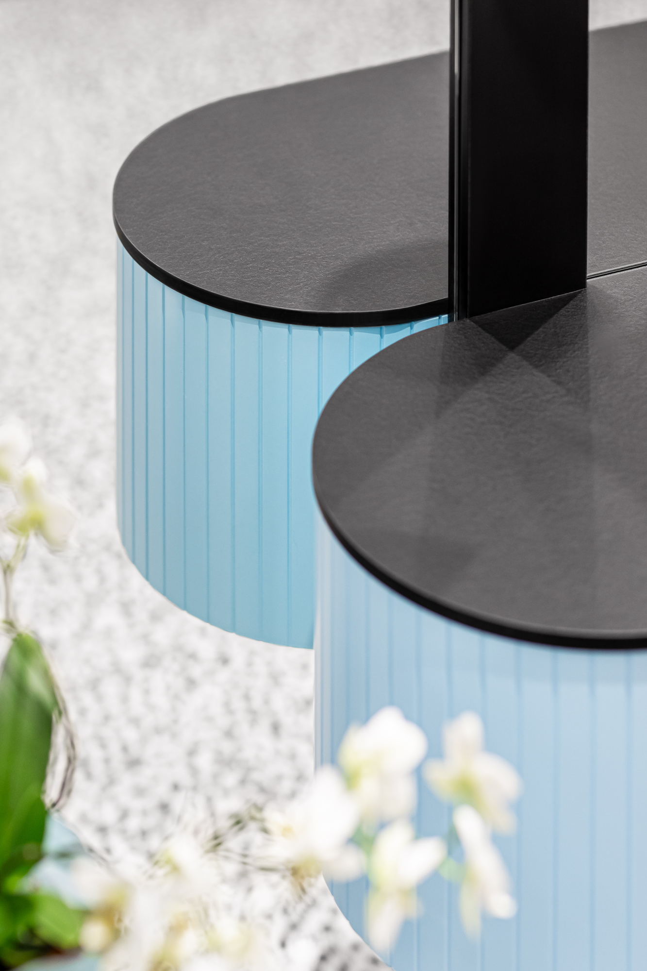
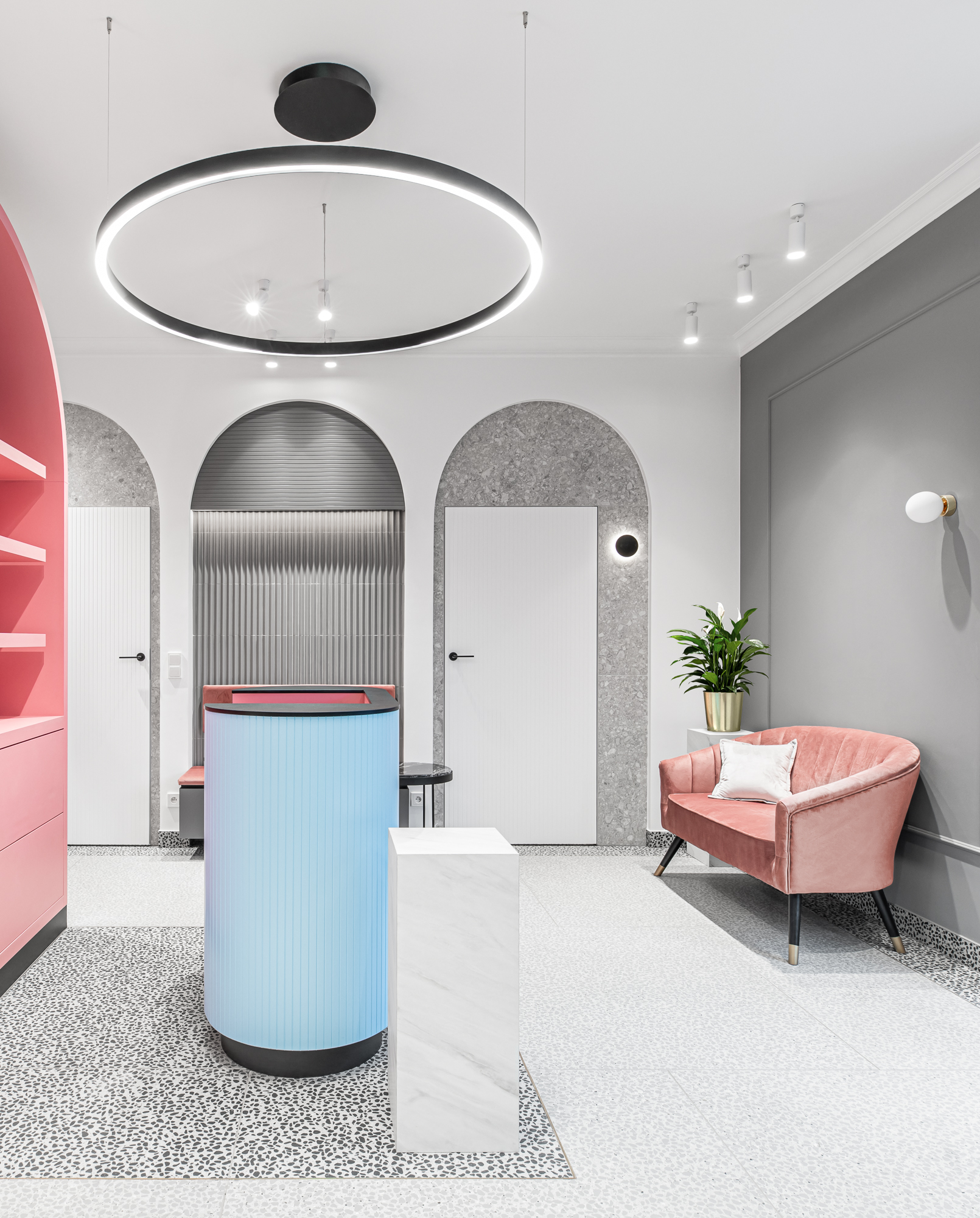

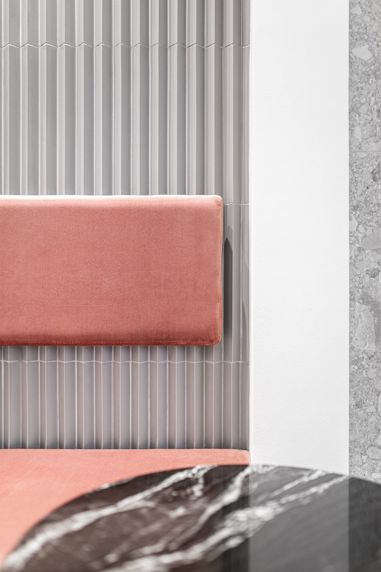
The design seeks to maintain a coherent language incorporating all the necessary elements that enhance work like luminaires that guarantee linear and equally distributed lighting for the services and furniture that was designed with attention to detail and work ergonomics.
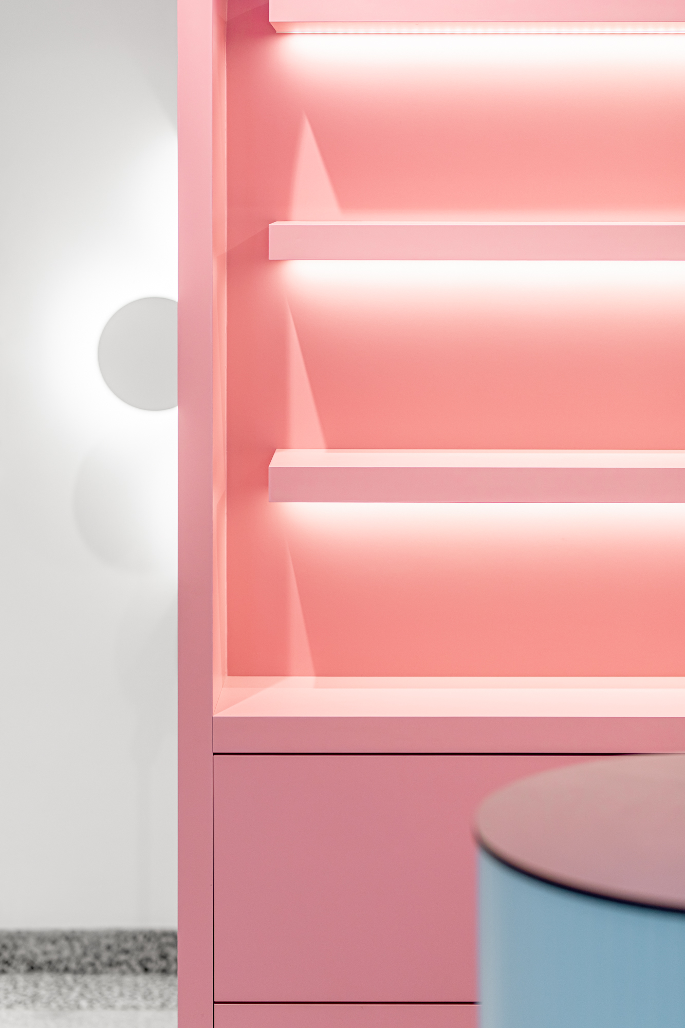
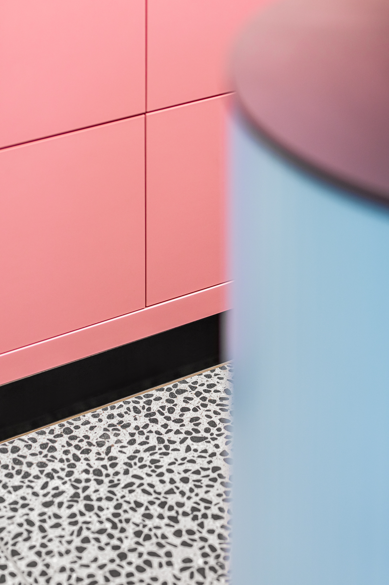
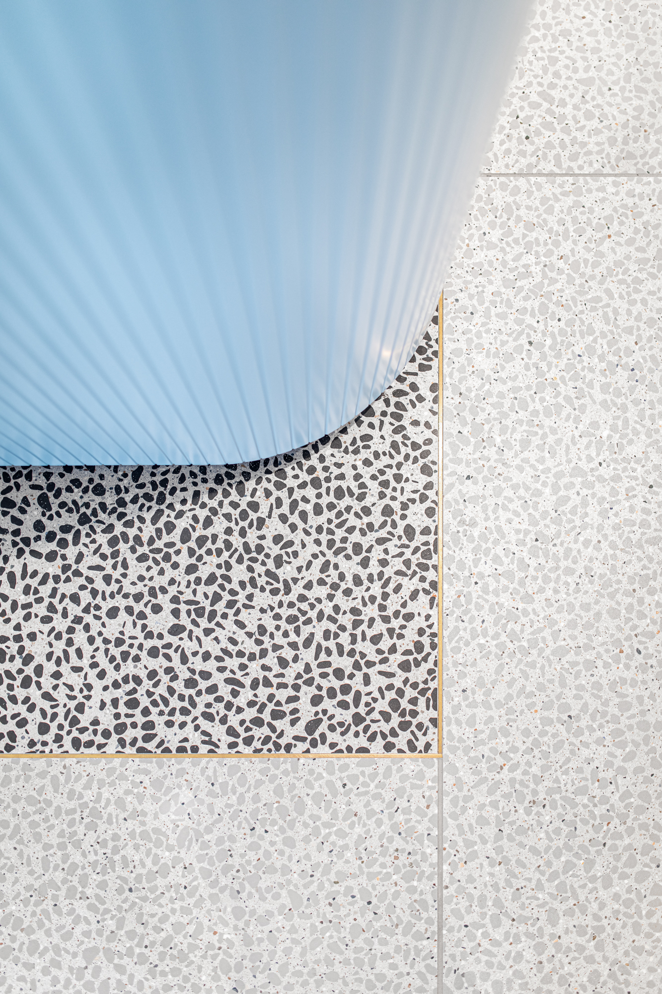
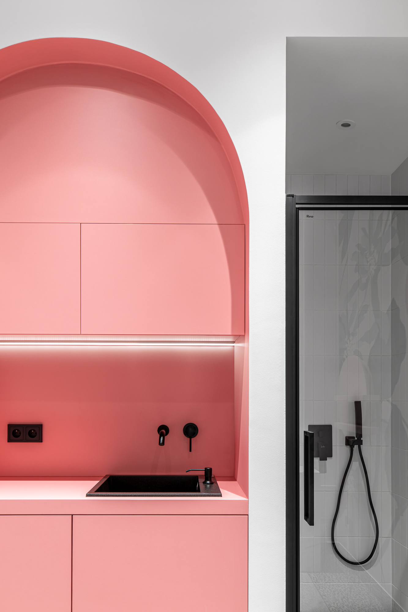
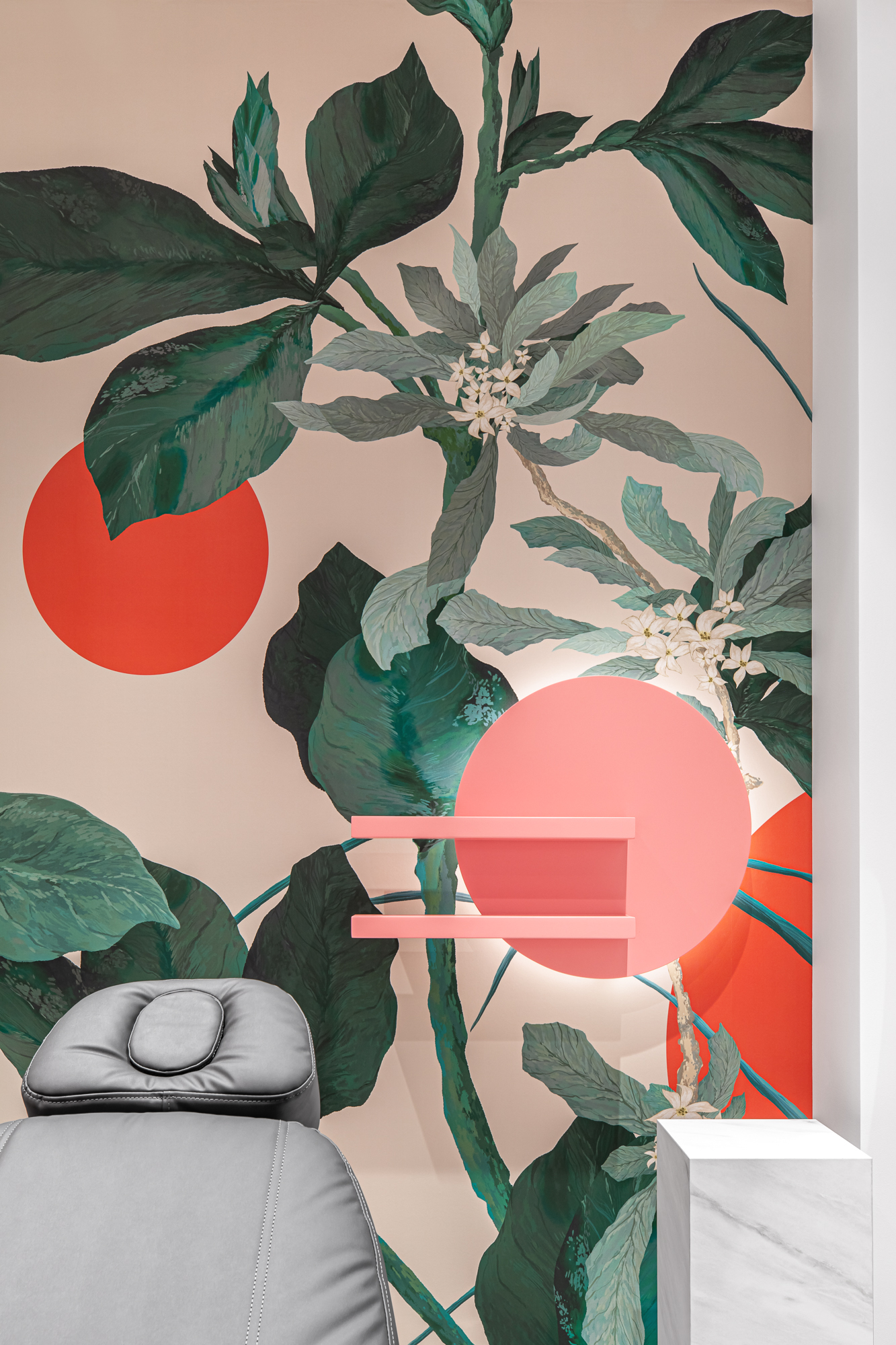
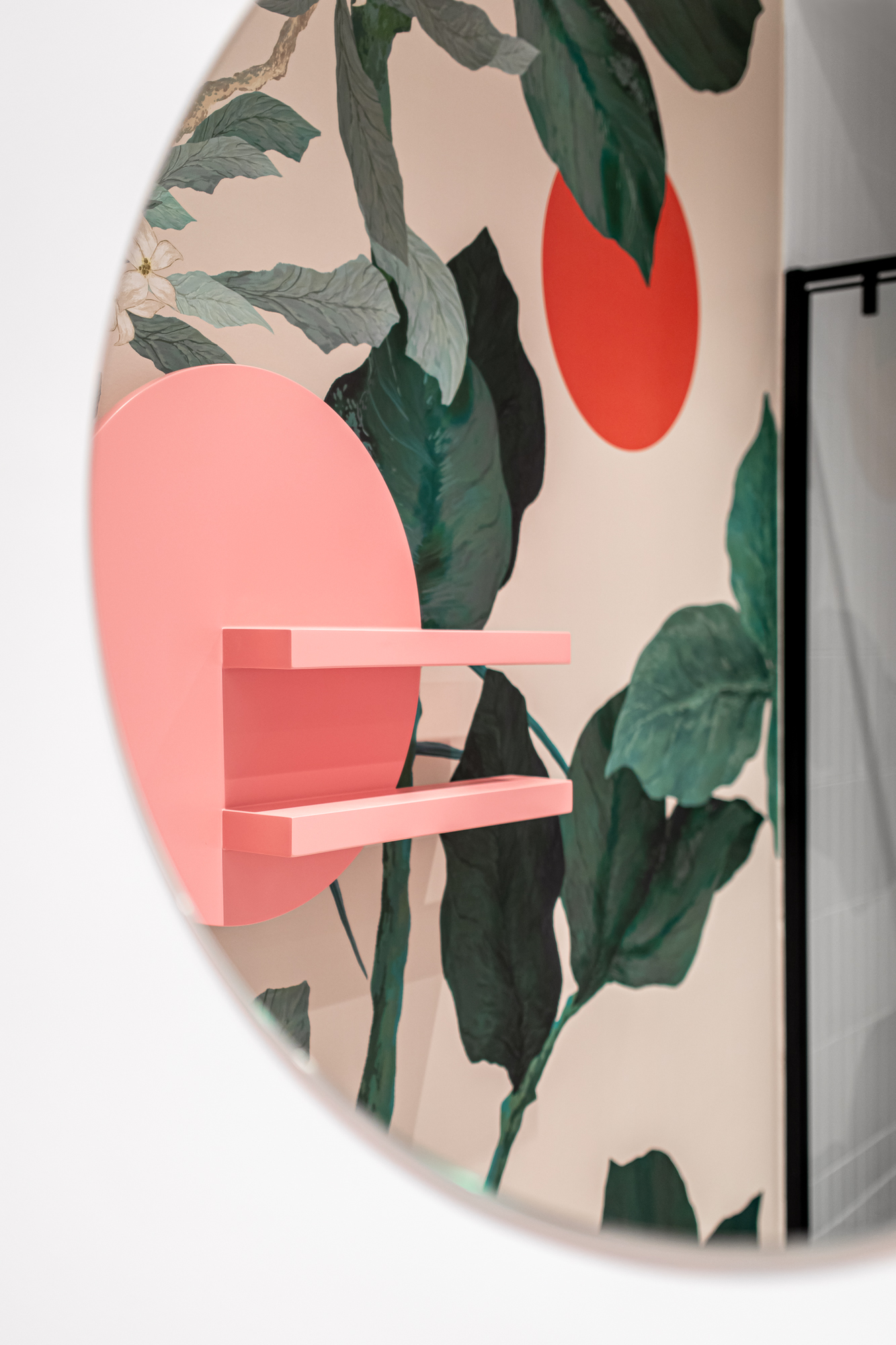
The predominant colors are light pink and blue, which contrast with the monochrome floors and walls. The use of round shape furniture and arches is a powerful statement of the design and concept of this project. It creates a playful environment with rhythmic repetitions, proportions, niches and details that are eye catching and strongly define each space.
